
Small Bathroom Color Schemes That Open Up the Room
Quick answer: Small bathroom color schemes that open up the room usually rely on light, low-contrast palettes with a matching undertone across walls, tile and fixtures. Keep walls and ceiling within one or two shades of each other, limit strong color to about 10 percent of the room, choose a moisture-rated finish, and test every swatch under your actual bathroom lighting at morning and evening before you commit.
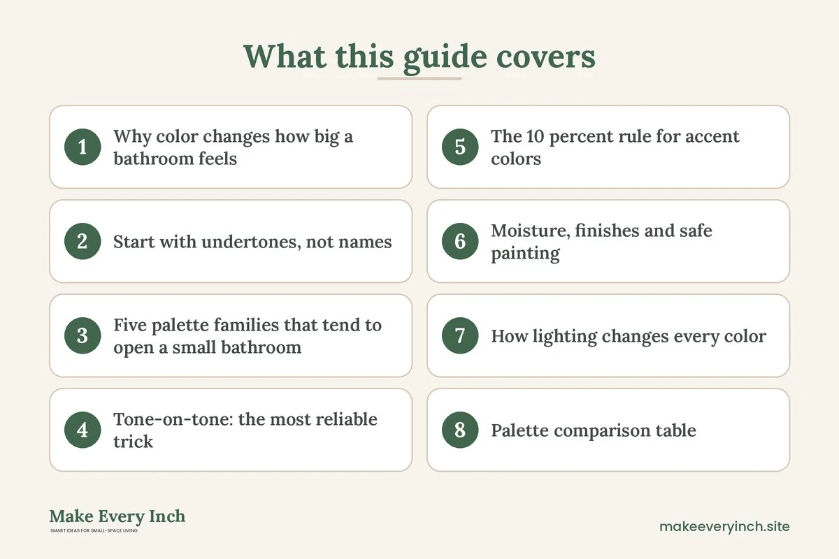
Small bathroom color schemes that open up the room are less about picking the one perfect paint chip and more about controlling contrast. A small bathroom has many hard edges in a short distance: a white tub, a dark floor, a mirror frame, a towel bar and a door. Every sharp change in tone tells the eye where a surface stops, and the more stops the eye finds, the smaller the room feels. A scheme that opens the room softens those stops, keeps undertones consistent and lets light travel across surfaces without being swallowed. This guide walks through undertones, five palette families, tone-on-tone layering, the rule for accent colors, paint finishes that suit damp rooms, the way lighting changes every color, a comparison table, three example bathrooms, a testing routine and a checklist. For the wider picture, start with our pillar guide to small bathroom ideas, and pair this post with the companion guide to small bathroom tile ideas.
Why color changes how big a bathroom feels
Color affects perceived size in three ways: lightness, contrast and continuity. Lightness is how much light a surface reflects. Pale surfaces bounce more of the available light around the room, so the walls seem to sit farther back. Contrast is the difference between neighboring surfaces. A white tub against a charcoal wall draws a hard line, while a white tub against a soft greige wall blends with it. Continuity is how long the eye can travel before it meets a boundary. When the wall, the ceiling and the upper part of the tile share a tone, the eye reads one tall surface instead of several short ones.
None of this means a small bathroom must be white. Deep, dark rooms can feel cozy and intentional, and some people prefer that effect. The point of this guide is the goal in the title: opening the room. If you want a moody, enveloping bathroom, a different set of rules applies, and you would give up the airy effect on purpose. If you want an airy, calm space that feels larger than its footprint, the rules below do most of the work.
Also remember that a bathroom is often seen in pieces. You stand at the sink and see the mirror and one wall. You sit in the tub and see the opposite wall and the ceiling. You stand in the doorway and see the whole room at once. A good scheme holds together from all three viewpoints, so check your plan from each of them.
Start with undertones, not names
Paint names are marketing. Undertones are what you actually live with. Every neutral has a hidden lean toward warm (yellow, red or pink), cool (blue, green or violet) or a near-neutral balance. A white that looks clean in a store can look muddy next to a cream tub or a gray floor, because the undertones fight each other.
How to read the undertones already in your room
You rarely start from a blank bathroom. You have a tub or shower surround, a floor, maybe a vanity, and these items are expensive to change. List them and read their undertones first.
- White fixtures: pure white, cool bright white and warm creamy white all exist. Hold a sheet of plain white printer paper against the tub. If the tub looks yellow next to the paper, it leans warm. If it looks blue or gray, it leans cool.
- Floor tile or vinyl: beige and tan floors lean warm. Gray floors can lean warm (greige), cool (blue-gray) or neutral. Look at the grout lines and the shadows, which show the undertone more clearly than the face of the tile.
- Wood or laminate vanity: orange and red woods lean warm. Gray and ash finishes lean cool. Walnut tones can sit in between.
- Metal finishes: brass and bronze lean warm, while chrome and nickel lean cool, and matte black reads as neutral and sharp.
Once you know the dominant undertone, choose wall colors that share it. A warm room suits warm whites, soft sand, pale clay and creamy greige. A cool room suits misty blue, pale gray-green, cool gray and crisp white. If the room has mixed undertones, aim for a true neutral, such as a soft greige with no strong lean, and use accessories to tip the balance.
The simple three-undertone rule
Keep the large surfaces (walls, ceiling, floor, tub) within one undertone family. Let the small items (towels, art, plants, soap bottles) introduce a second undertone for contrast. Large surfaces that disagree make a small room look unsettled, while small accents that disagree look curated.
Five palette families that tend to open a small bathroom
These palettes are starting points. Each one lists the base, the supporting tone, the accent and the warning signs. Names of paint shades are intentionally generic, because you will test real samples anyway.
1. Soft white and warm greige
A warm white on the walls and ceiling, a pale greige on the vanity or the lower wall, and natural wood or woven accents. This palette is forgiving, suits most existing fixtures and brings in warmth without darkness. Its risk is blandness, which you solve with texture: a ribbed towel, a rattan basket, a linen shower curtain.
2. Pale gray-green and white
A whisper of green-gray on the walls, with white trim and tile. Gentle green feels fresh and connects the room with plants. It suits bathrooms with a lot of white and chrome. The risk is that some greens turn sickly under warm bulbs, so test them under your actual lighting.
3. Misty blue and crisp white
A pale blue with a hint of gray reads like sky and water. It tends to recede, which helps in a narrow room. It suits cool fixtures and white tile. The risk is chill. Add warm wood, brass-toned hardware or cream towels so the room does not feel like a clinic.
4. Pale blush and cream
A very light blush or sand-pink, combined with cream or white. Warm pinks flatter skin in the mirror, which is a practical advantage at the sink. Keep the saturation low so the room reads as a soft neutral and not as a color statement. The risk is sweetness, which you balance with black or deep brown accents.
5. Monochrome gray ladder
Three or four grays from pale to mid, used from ceiling to floor. It is a modern look that uses tone-on-tone layering (see below). The risk is a flat, cold room, so choose grays with a slight warm or green lean and bring in wood.
Tone-on-tone: the most reliable trick
Tone-on-tone means using several shades of one color, close together in lightness, so edges soften. In a small bathroom, it is the closest thing to a rule that works almost everywhere.
Match the ceiling and walls, or sit one step apart
Painting the ceiling the same color as the walls, or one step lighter, removes the hard line at the top of the wall. The ceiling seems to float higher, because the eye does not stop at the corner. A pure bright white ceiling over colored walls draws a sharp outline around the room, which can make the ceiling look lower. If you want contrast, keep the ceiling a half-step lighter than the walls and not a stark white.
Wrap the trim into the wall
Trim painted in a contrasting white calls attention to the room’s edges. Painting the trim in the wall color, or in a slightly lighter shade of it, reduces the number of lines. Door frames, window frames and baseboards all blend. Many small spaces feel calmer this way.
Choose the fixtures as part of the ladder
A white tub and a white toilet are fixed. Choose a wall color that sits one or two steps from white, so the fixtures read as part of the ladder, not as bright blocks. A soft gray-white wall next to a bright white tub looks intentional, while a mid-tone wall next to the same tub makes the tub glow like a spotlight.
Match the tile and grout
Grout is a line, and lines multiply in a small bathroom. Choose a grout in the same tone as the tile so the surface reads as one plane. You can find more on this in our post on small bathroom tile ideas.
The 10 percent rule for accent colors
Bold color has a place in a small bathroom, but the amount matters. A useful guideline is to keep strong color to roughly 10 percent of what the eye sees from the doorway. That share can be one wall, a vanity, a shower curtain, a door, or a set of towels and art, but not all of those at once.
Where to spend the accent
- The door: a deep color on the inside of the bathroom door gives you drama and leaves the walls light. Because the door is often partly open, it also frames the view from the hallway.
- The vanity: a painted vanity in deep green or navy anchors the room. Pair it with light walls and a light floor so the dark block reads as one piece of furniture and not as a wall of darkness.
- The shower curtain or towel set: the most flexible option, and the least permanent. It suits renters and anyone who changes their mind.
- One wall behind the vanity or the toilet: a single accent wall draws the eye to one end of the room. Choose the wall you face when you enter, or the one behind the mirror.
What to avoid
Avoid more than two accent colors. Avoid accent colors that are far from the main palette in lightness, such as a near-black next to a pale pink, unless that contrast is your goal. Avoid painting the smallest wall the boldest color if it makes the room feel boxed in. And avoid saturated colors on a wall next to a window you rely on for light, because they absorb daylight.
Moisture, finishes and safe painting
Color is only half the story, because paint in a bathroom has to survive steam. The finish also changes the color you see, since glossier surfaces reflect more light and show more imperfections.
Choosing a finish
- Flat or matte: hides wall flaws, but marks and cleans less well. In a damp room, it can look chalky and hold moisture. Many people reserve it for ceilings in rooms with good ventilation.
- Eggshell or satin: a balanced choice for walls. It reflects a little light and wipes clean more easily.
- Semi-gloss: good for trim, doors and the area around the tub or sink. It repels splashes best, but it highlights wall dents.
- High gloss: reflects the most light and can feel glamorous, but shows every flaw.
Look for paint described by the maker as suitable for bathrooms or damp rooms, and read the label for the recommended use. Moisture-rated or mildew-resistant products are made for these conditions, though no paint can fix a room with poor ventilation. If you are unsure which product suits your walls, ask at a paint counter and read the data sheet.
Safety and ventilation notes
- Ventilate while painting and while curing. Open a window, run the exhaust fan if it is working, and follow the label’s guidance on drying and recoat times. A bathroom is a small enclosed space, so fumes concentrate quickly. Choose low-VOC or zero-VOC products where possible, and keep pets, children and anyone sensitive out of the room during painting.
- Fix the cause of mold before painting. If you see black spots, peeling paint or soft drywall, the problem is moisture, not color. Painting over active mold or damp wall hides the problem and may trap moisture. Treat the source, dry the wall fully and follow the cleaning guidance for your situation, or ask a professional if the area is large.
- Run the fan. A working exhaust fan, run during a shower and for a while afterward, helps paint last. If you do not have a fan, a window or a portable approach to airing out the room can help. If the fan is weak or noisy, tell your landlord or consult an electrician or a qualified contractor.
- Electrical safety. Turn off power at the breaker before removing a switch plate or fixture cover to paint around it, and never paint over outlets or switches. Do not use extension cords or portable electric heaters near water. Bathroom outlets should be protected by a ground fault circuit interrupter (GFCI). If an outlet is missing this protection or looks damaged, have a qualified electrician look at it.
- Slip risk. A wet bathroom floor is slippery. When you paint, tape drop cloths that do not shift, and wipe up water and drips promptly. Use a mat with a non-slip backing, and keep cords and tools off the floor.
- Renters. Check the lease before painting. Many leases require written permission and a return to the original color. If paint is not allowed, move the color to removable items: a curtain, towels, art, a bath mat, a stool or a tray. For removable finishes, see our guides to removable wallpaper ideas and renter-friendly bathroom ideas.
How lighting changes every color
A paint chip seen in a store is not the color you will see at home. Light source, direction and time of day all shift color, and in a windowless bathroom the lightbulb is the only source.
Bulb color temperature
Bulbs are labeled in kelvins. A range around 2700K gives a warm, yellowish light that deepens warm colors and turns cool grays beige. A range around 3000K is a neutral warm white that suits most bathrooms. A range around 4000K to 5000K is cooler and bluer, which brightens white tile but can make skin look pale and flat. For a bathroom mirror, many people choose a light that is neutral to warm, around 2700K to 3000K, with a high color rendering index so skin tones look natural. See our guide on small bathroom lighting ideas for the full approach.
Direction and layering
Light from above makes shadows under your eyes and chin. Light on both sides of the mirror, or a lit mirror, reduces shadows. Light that washes a wall makes the wall appear farther away. A single bright ceiling light in the middle makes the corners look dim and the room small. Plan to use at least two sources: a general light and a task light at the mirror.
Daylight
A north-facing window gives a cool, steady light that can make warm colors look dull. A south-facing window gives a warmer, brighter light that can wash out pale colors. East windows give warm morning light and cooler afternoons. If your window is frosted or small, a glossier finish near it spreads the light farther.
The mirror and glossy surfaces
A mirror doubles light and also doubles color. A large mirror reflecting a pale wall makes the room seem twice as wide. A mirror reflecting a dark or very saturated wall doubles that heaviness. Place the mirror so that it reflects the lightest surface, or the window.
Safe lighting notes
Use bulbs and fixtures rated for damp or wet locations when they are near the shower or tub. If you change a fixture, switch off the breaker first, and use a qualified electrician if you are unsure about the wiring. Do not plug lamps into outlets near water unless the outlet is GFCI protected, and keep cords away from sinks and tubs.
Palette comparison table
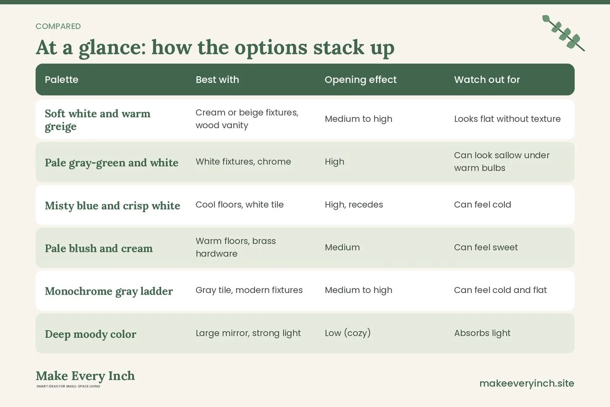
Use the table below to compare the five families against practical concerns. Effects depend on your lighting, your fixtures and your own eye, so read it as a guide.
| Palette | Best with | Opening effect | Watch out for | Easy accents |
|---|---|---|---|---|
| Soft white and warm greige | Cream or beige fixtures, wood vanity | Medium to high | Looks flat without texture | Linen, rattan, wood |
| Pale gray-green and white | White fixtures, chrome | High | Can look sallow under warm bulbs | Plants, glass |
| Misty blue and crisp white | Cool floors, white tile | High, recedes | Can feel cold | Warm wood, cream towels |
| Pale blush and cream | Warm floors, brass hardware | Medium | Can feel sweet | Black or deep brown accents |
| Monochrome gray ladder | Gray tile, modern fixtures | Medium to high | Can feel cold and flat | Wood, brass, greenery |
| Deep moody color | Large mirror, strong light | Low (cozy) | Absorbs light | White towels, bright bulbs |
Three example bathrooms
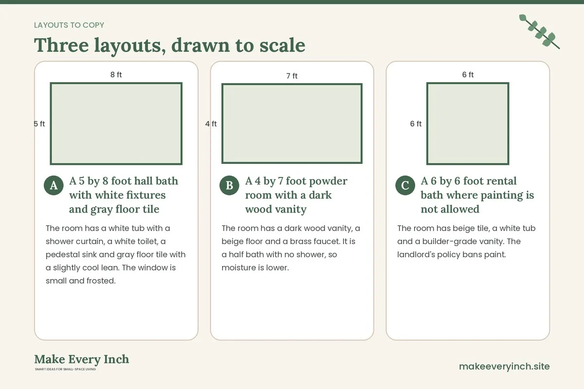
A 5 by 8 foot hall bath with white fixtures and gray floor tile
The room has a white tub with a shower curtain, a white toilet, a pedestal sink and gray floor tile with a slightly cool lean. The window is small and frosted.
A cool-leaning palette suits this room. Paint the walls and ceiling a pale misty gray-blue, one step apart, in an eggshell or satin finish. Paint the trim in the wall color in semi-gloss, so the lines fade. Choose a white or pale gray shower curtain with a faint texture, since a patterned curtain would break the continuity. Add warmth with a wood stool, a natural woven basket and cream towels. Use a mirror that fills most of the wall above the sink and a neutral warm bulb. The small window gets a sheer privacy film instead of a heavy blind, and the pale wall near it helps spread its light.
A 4 by 7 foot powder room with a dark wood vanity
The room has a dark wood vanity, a beige floor and a brass faucet. It is a half bath with no shower, so moisture is lower.
This is the place to use more color. Choose a warm sand or soft clay on the walls and ceiling, which pairs with the wood and brass. Keep the ceiling the same color for a wrapped feeling, or go one step lighter. Add a round mirror to soften the corners, and a pair of wall lights on either side. Because moisture is lower, a satin finish suits the walls. The accent is the door, painted a deeper terracotta on the inside. Keep the towel and the soap bottles in cream and brown so the 10 percent rule holds.
A 6 by 6 foot rental bath where painting is not allowed
The room has beige tile, a white tub and a builder-grade vanity. The landlord’s policy bans paint.
Work with the existing undertone. The beige tile leans warm, so choose a warm palette for removable items: a cream shower curtain, sand towels, a soft green bath mat and a wood tray. Add a large mirror leaned or hung with a method the lease allows, and use no-drill options for rails and shelves. Swap yellow bulbs for a neutral warm white, if the lease allows replacing bulbs. Add a plant that tolerates humidity. The accent is the curtain, and the rest of the room stays quiet. For more rental ideas, see renter-friendly bathroom upgrades. Do not drill into tile or the tub surround without written permission, and if you use adhesive hooks, check their rating for damp conditions and follow the weight limits.
How to test colors before you paint
Testing is where most color mistakes are prevented. Do not choose from a small chip under store lights.
- Buy sample pots or use large swatch sheets. Paint a sample on a large piece of white board or heavy paper, roughly 2 feet square, so you can move it around.
- Test on two walls. Tape the sample to the wall near the window and the wall farthest from it. Colors change from one wall to another.
- Look at three times of day. Check in the morning, in the afternoon and in the evening with the bulbs on.
- Look next to your fixtures. Hold the sample against the tub, the floor and the vanity. If the undertones fight, the problem will not go away after painting.
- Live with it for several days. The first impression is often wrong, and a color that survives a week of ordinary use is usually the right one.
- Check the mirror. Stand at the sink and check how the color reflects, and how your skin looks in it.
Always follow the product label for preparation, which usually means cleaning, degreasing, repairing cracks, sanding glossy surfaces and priming where needed.
Common mistakes
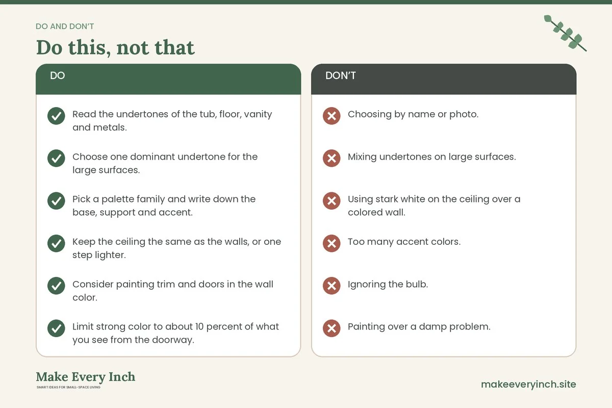
- Choosing by name or photo. Photos are edited and displays differ. Test real samples.
- Mixing undertones on large surfaces. A pink-beige tile next to a blue-gray wall can look dirty. Match the dominant undertone.
- Using stark white on the ceiling over a colored wall. It draws a line at the top. Soften it by one step.
- Too many accent colors. Stick to one or two beyond the base palette.
- Ignoring the bulb. A cool bulb can turn a warm room gray, and a warm bulb can turn a cool room green.
- Painting over a damp problem. Fix the moisture source first.
- Forgetting the floor. A very dark floor with light walls makes a hard line at the base. Use a rug in a middling tone to bridge the two.
- Skipping a satin or semi-gloss finish. A flat finish in a steamy room can mark and mildew more easily.
Quick scheme recipes
If you want a fast starting point, try one of these formulas and adjust after testing.
The airy neutral
Walls and ceiling in a warm white with a soft greige undertone, trim in the same color, a cream shower curtain, woven baskets, a wood stool and a mirror with a thin frame.
The fresh spa
Walls in pale gray-green, ceiling one step lighter, white tile, white towels, a wood bath mat and a plant. Add a soft white light near the mirror.
The soft coastal
Walls in misty blue, white trim, sand-colored towels, a rope basket and chrome fixtures. Keep patterns simple, like a narrow stripe.
The warm blush
Walls in pale blush with a hint of beige, cream ceiling, brass hardware, dark brown accents and a round mirror. Keep saturation low.
The one bold touch
Light neutral walls and ceiling, with the vanity or the door painted a deep green or navy. Use white towels, a large mirror and bright lighting to keep the room open.
Checklist
- Read the undertones of the tub, floor, vanity and metals.
- Choose one dominant undertone for the large surfaces.
- Pick a palette family and write down the base, support and accent.
- Keep the ceiling the same as the walls, or one step lighter.
- Consider painting trim and doors in the wall color.
- Limit strong color to about 10 percent of what you see from the doorway.
- Choose a moisture-rated finish: satin or eggshell for walls, semi-gloss for trim.
- Test samples on two walls at three times of day with your real bulbs.
- Check the lease before painting, and plan removable color if paint is not allowed.
- Fix any moisture or mold source before painting.
- Ventilate while painting, and choose low-VOC products where possible.
- Confirm the outlets are GFCI protected, and turn off power before working near fixtures.
- Add a non-slip mat, and keep the floor clear of drips and cords.
- Choose bulbs around 2700K to 3000K at the mirror unless your testing says otherwise.
- Place the mirror to reflect the lightest surface or the window.
FAQ
What is the best color for a small bathroom?
There is no single best color, but light colors with low contrast, such as warm white, pale greige, soft gray-green and misty blue, tend to make a small bathroom feel more open. Match the undertone to your existing fixtures and test samples under your own lighting.
Does white always make a small bathroom look bigger?
White reflects light and can help, but a stark white next to cream fixtures or a warm floor can look harsh. A softly tinted white or a pale neutral that matches your undertones often looks calmer and more spacious.
Can I use a dark color in a small bathroom?
Yes, if you want a cozy, enveloping look. It will not open the room in the same way, so balance it with strong lighting, a large mirror and light accents. Many people use a dark color on the vanity or the door instead of every wall.
Should the ceiling be white?
Not necessarily. Painting the ceiling the same as the walls, or one step lighter, removes the hard line at the top of the walls and can make the ceiling seem higher. A bright white ceiling over colored walls draws a line at the top.
What paint finish is best for a bathroom?
Many people choose satin or eggshell for walls and semi-gloss for trim, with a product labeled for bathrooms or damp rooms. Ventilation matters as much as the finish, so run the fan during and after showers.
How do I add color if I rent?
Use removable items such as a shower curtain, towels, a bath mat, art, a stool, a tray and plants. Check the lease before painting, and ask for written permission if you want to change the walls.
Does the light bulb really change paint color?
Yes. Warm bulbs deepen warm tones and can turn cool grays beige, while cool bulbs can make warm colors look flat. Test samples with the bulbs you plan to use.
Can I paint over mildew?
It is better to deal with the cause first. Painting over active mold or damp walls can hide a problem and may trap moisture. Clean the area using guidance suited to your situation, dry it fully, improve ventilation, and consult a professional if the area is large or keeps returning.
Keep going: Keep planning with our small bathroom tile ideas, small bathroom lighting ideas and small bathroom organization ideas.
Save this guide for later
Pin the ideas you like to Pinterest so you can come back to them when you plan your space.