Small Bedroom Color Schemes for a Calm Space: 7 Palettes
Quick answer: The best small bedroom color schemes calm space seekers can use are built from one soft, low-contrast base (warm white, greige, pale sage, dusty blue or soft clay), a slightly deeper second tone, and one quiet accent. Match the undertone to your window direction, keep contrast low, use the 60-30-10 split, choose a matte or eggshell finish, ventilate while painting and pick low-VOC paint. Renters can get the same calm from bedding, curtains and lamp light.
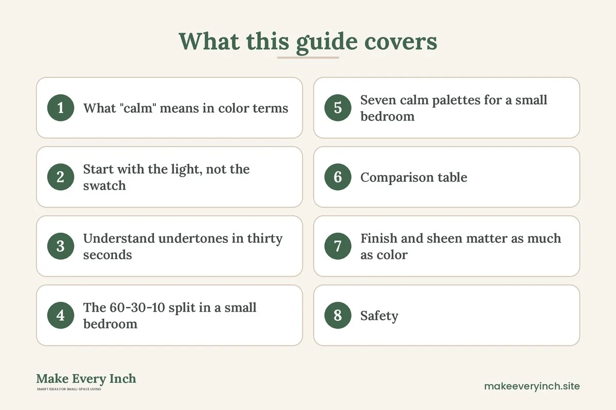
Small bedroom color schemes calm space lovers return to share one trait: nothing in them shouts. In a room where the bed fills most of the floor, every surface is close to your eyes at bedtime, so the colors you pick shape how restful the room feels far more than they would in a large living room. This guide takes a practical route. It explains how window direction changes the same paint, how to build a palette with the 60-30-10 split, how to read undertones, which finishes soften a small room, and seven complete palettes with the exact roles each color plays. It also covers a table of palettes by light, three example bedrooms, a no-paint plan for renters, safety notes on paint fumes, and a checklist. For the full picture of the room, start with our main guide to small bedroom ideas. If you want a broader look at color across the whole home, our post on colors that make small rooms look bigger is a good companion, and the sibling post on small bedroom furniture that saves space covers the pieces that sit on top of your palette.
What “calm” means in color terms
Calm is not a single color. It is a set of conditions that any color can meet. Rooms feel calm when the contrast between neighboring surfaces is low, when the saturation is moderate, and when the eye finds a few places to rest instead of many places to jump. A pale sage wall beside a pale sage curtain and a bed in a slightly deeper green feels still. The same sage wall beside a bright orange cushion and a black frame feels busy, even though the base color has not changed.
Three measurable ideas help:
- Low contrast between wall and large furniture. If the headboard, wall and curtains sit within two or three shades of each other, the room reads as one soft block.
- Moderate saturation. Colors that look slightly grayed, chalky or milky tend to relax a room more than clean, vivid tones. You can test this by holding a swatch beside a sheet of white paper. If the swatch looks strongly colored next to the paper, it will likely feel energetic on four walls.
- Few focal points. One accent area is restful. Five competing accents are not.
None of this means you must choose beige. Deep, low-contrast colors, such as a muted green or dusty navy applied to walls, ceiling and trim in the same tone, can be very calm in a bedroom used mostly at night. The rule is the same: keep the steps between surfaces small.
Start with the light, not the swatch
The same paint looks different in every room because the light changes it. Before choosing a color, note which way your bedroom window faces and when you use the room most. Compass directions below assume the northern hemisphere. In the southern hemisphere, swap north and south.
- North-facing rooms receive cooler, steadier light with fewer shadows. Cool colors can look flat or gray here. Warm whites, soft clay, creamy greige and warm sage keep the room from feeling chilly.
- South-facing rooms get warm, bright light for much of the day. Cool and neutral tones, such as dusty blue, pale gray-green and cool white, balance the warmth and stay fresh.
- East-facing rooms are bright and warm in the morning and softer by afternoon. Most palettes work, though very warm yellow tones can feel strong at sunrise.
- West-facing rooms are shady in the morning and warm in the evening. Colors can shift toward orange late in the day, so pick colors with a steady undertone and look at them at dusk.
If you want more help with dim rooms, read our post on small room paint ideas for low light. If the room has a small window or a courtyard view, the advice there matters more than the choice of hue.
A simple test saves regret. Paint two large sample patches, each about 12 inches square, on different walls, or on sheets of card that you tape up. Look at them in the morning, at midday and at night with your bedside lamps on. Because you mostly use the room in artificial light, the lamp test is the one that counts.
Understand undertones in thirty seconds
Every neutral has an undertone, a hint of another color hidden underneath. Whites and grays lean warm (yellow, red, pink) or cool (blue, green, violet). Mixing undertones is the most common reason a bedroom looks off. A cool gray wall beside a warm cream bedspread will look dingy on one side and yellow on the other.
To read an undertone, set the swatch on a pure white sheet of paper. Compare it with a gray card or a plain gray surface. If the color seems to lean toward green, blue or violet it is cool, and if it leans toward peach, yellow or pink it is warm. Then choose all the large items in the room, such as walls, headboard, curtains, rug and bedding, with the same lean. You can add contrast with value, meaning light versus dark, but keep the undertone family constant.
The 60-30-10 split in a small bedroom
Interior designers often use the 60-30-10 guide because it keeps palettes in proportion. In a small bedroom it works like this:
- 60 percent: the base. Walls, ceiling and often the large rug or curtains if they match. Choose the quietest tone.
- 30 percent: the secondary. Bed linens, a headboard, curtains, an upholstered chair or a painted dresser. This tone is a step deeper or a different material.
- 10 percent: the accent. Pillows, a throw, a lamp base, artwork, a plant pot or a bedside object. This is where your personality shows.
In very small rooms, consider a 70-25-5 split to reduce the number of competing elements. The percentages are not measured with a ruler. They are a reminder that one tone should dominate, one should support, and one should whisper.
Seven calm palettes for a small bedroom
Each palette below lists the role of every color. Use the names as a description, not a product. Take them to a paint counter and look for the closest match.
1. Warm white and oatmeal
Base: a warm white on walls and ceiling. Secondary: oatmeal or flax bedding and curtains. Accent: a soft clay pillow and a wooden lamp base. This is the most forgiving palette because it reflects light and hides small wall flaws. It suits north-facing and low-light rooms, and it is an excellent starting point for first-time painters.
2. Pale sage and cream
Base: a gray-green sage with a hint of warmth. Secondary: cream bedding and a linen curtain. Accent: a dark olive throw and a houseplant. Green sits in the middle of the color spectrum, so the eye finds it restful. This palette works in most light directions, and it pairs well with wood.
3. Dusty blue and soft gray
Base: a muted blue with a little gray in it. Secondary: a light gray or white bedspread. Accent: a brass-toned or black lamp and a slate pillow. Blue works best in bright, warm rooms with south or west windows. In a north-facing room, add warm wood and a warm bulb to keep the blue from feeling cold.
4. Greige and charcoal
Base: a greige wall (a gray-beige blend). Secondary: a mid-gray headboard and bedding. Accent: charcoal frames and a black bedside lamp. The charcoal gives structure, and the greige keeps the room soft. Keep the charcoal below 10 percent so the room does not feel heavy.
5. Soft clay and blush
Base: a pale terracotta or blush plaster tone. Secondary: off-white bedding. Accent: a deep brown wood stool and a rust-colored throw. This palette feels warm and cocooning, and it flatters skin tone in lamp light. It suits rooms that feel cold or are used mainly in the evening.
6. Mushroom and deep green
Base: a mushroom or taupe wall. Secondary: a deep green headboard or velvet pillow cover. Accent: natural wood and a brass lamp. This is a richer palette for people who like a moody bedroom. Keep the ceiling a pale version of the wall color so the dark tones do not close in on you.
7. Monochrome navy, wall to ceiling
Base: a deep, muted navy painted on walls, ceiling and trim in the same color. Secondary: a white or pale gray bed. Accent: warm wood and a linen shade. Using one color everywhere removes the edges of the room, so the walls seem to recede. It is a dramatic choice. Use it only if you are comfortable with a darker room, and plan enough lamp light (see our post on small bedroom lighting ideas).
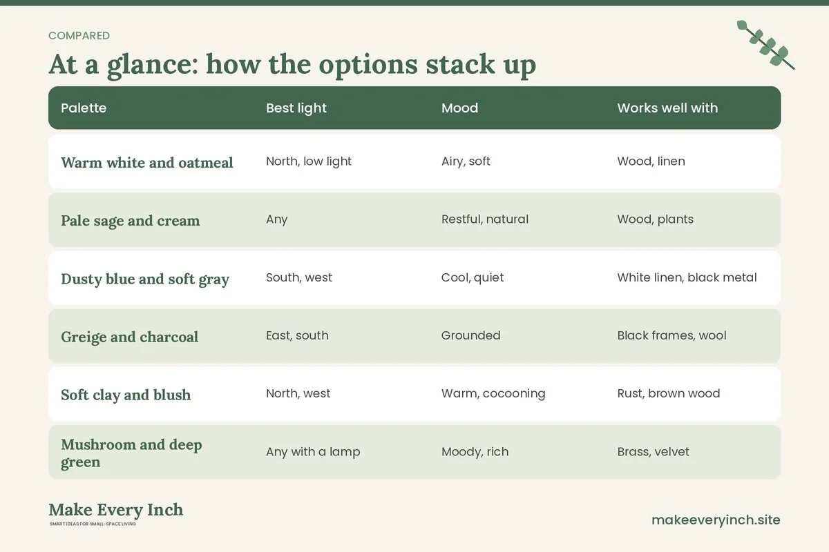
Comparison table: which palette for which room
| Palette | Best light | Mood | Works well with | Watch out for |
|---|---|---|---|---|
| Warm white and oatmeal | North, low light | Airy, soft | Wood, linen | Can look flat without texture |
| Pale sage and cream | Any | Restful, natural | Wood, plants | Cool sage in shade can look gray |
| Dusty blue and soft gray | South, west | Cool, quiet | White linen, black metal | Can feel cold at night |
| Greige and charcoal | East, south | Grounded | Black frames, wool | Too much charcoal feels heavy |
| Soft clay and blush | North, west | Warm, cocooning | Rust, brown wood | Pink undertones in warm light |
| Mushroom and deep green | Any with a lamp | Moody, rich | Brass, velvet | Needs good lighting |
| Monochrome navy | South, west | Enclosed, dramatic | Warm wood, white | Needs strong bedside light |
Finish and sheen matter as much as color
The finish changes how light bounces. In a small bedroom, glare is the enemy of calm, so aim for low sheen.
- Flat or matte absorbs light and hides wall flaws. It is the softest look, though it is harder to wipe clean.
- Eggshell has a slight sheen and is easier to wipe, which suits a room where headboards and hands touch the wall.
- Satin is better for trim and doors, where it resists scuffs. Using it on large walls can create reflections that disturb the quiet look.
Ceilings take a flat finish. Painting the ceiling a very pale tint of the wall color, rather than stark white, softens the edge between wall and ceiling and makes the room feel less boxy. If the ceiling is low, keep the ceiling lighter than the walls and avoid strong horizontal lines at the top of the wall.
Safety: paint fumes, ventilation and lease rules
Painting a bedroom is a bigger project than it looks, because you sleep in the room afterward. A few safety habits make it healthier.
- Choose low-VOC or zero-VOC paint where available. Look for that wording on the can and ask the store for guidance. These paints release fewer fumes, though they still need airing.
- Ventilate during and after painting. Open windows on two sides if you can, and run a fan to push air out of the window. Allow the room to air out for several days before sleeping in it, and longer if you notice a smell.
- Keep children, pregnant people and pets out of the room while painting and while the paint dries. Check the label for any specific warning.
- Protect electrics. Turn off the power at the breaker before you remove switch plates and outlet covers, and do not paint over the outlets themselves. Keep wet rollers and drips away from sockets.
- Check the lease before painting. Many leases require written permission, and some require you to repaint before you leave. If the answer is no, use the renter plan below.
- Mind old paint. In older buildings, paint applied before the late 1970s may contain lead. If you plan to sand or scrape, ask the landlord or a qualified professional to confirm what is on the walls first, and never dry-sand paint of unknown age.
A no-paint plan for renters
You can build a calm palette without touching the walls. The colors you can change are bedding, curtains, rugs, lampshades, art and bulbs.
1. Make the bed the base. Choose a duvet cover, sheet and bed skirt in one calm color. Because the bed is the largest object in a small bedroom, it often defines the palette by itself.
2. Use curtains to recolor the wall. A full-width curtain in a soft color covers a large piece of wall. Hang the rod close to the ceiling, which also adds height. Our post on small space curtain ideas to add height shows how, and renter friendly window treatment ideas lists options that avoid drilling.
3. Add a rug that bridges the colors. A rug in a muted tone ties the bed to the floor. Use a non-slip pad, and keep the edges clear of the door.
4. Warm the light. A bulb at around 2700 kelvin warms white walls. Use dimmable bulbs if the fixture allows it.
5. Swap, do not stick. If you want to cover a wall color you dislike, lean a large piece of fabric-covered board or a framed print against it. Do not drill or use adhesives unless the lease allows it. For more options, see our small bedroom ideas for renters post.
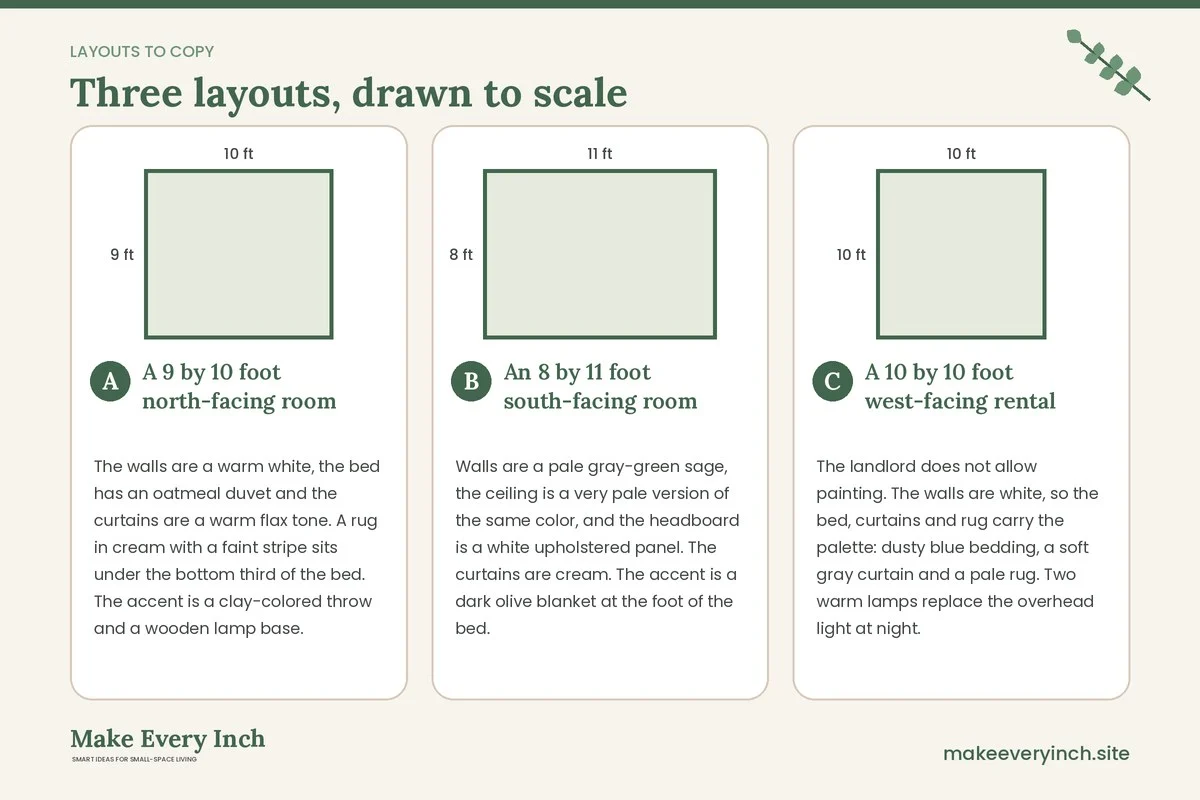
Three example bedrooms
A 9 by 10 foot north-facing room
The walls are a warm white, the bed has an oatmeal duvet and the curtains are a warm flax tone. A rug in cream with a faint stripe sits under the bottom third of the bed. The accent is a clay-colored throw and a wooden lamp base. Because the light is cool, the warm base keeps the room from looking gray, and the narrow tonal range makes the room read as larger.
An 8 by 11 foot south-facing room
Walls are a pale gray-green sage, the ceiling is a very pale version of the same color, and the headboard is a white upholstered panel. The curtains are cream. The accent is a dark olive blanket at the foot of the bed. South light warms the sage so it feels fresh instead of cold, and the cream keeps the contrast soft.
A 10 by 10 foot west-facing rental
The landlord does not allow painting. The walls are white, so the bed, curtains and rug carry the palette: dusty blue bedding, a soft gray curtain and a pale rug. Two warm lamps replace the overhead light at night. In the evening sun, the blue balances the orange glow, and in the morning the room stays cool. The tenant adds a framed print in the same blue family, leaning on the dresser instead of hanging it.
Texture is the second color
When a palette has little contrast, texture creates the interest that color would otherwise supply. A room with only smooth surfaces can look dull. Mix a few textures, such as a knit throw, a linen curtain, a woven basket and a matte ceramic lamp base. Keep the colors the same and vary the surface. This is the reason many calm rooms in magazines feel layered even though they only use two or three colors.
Keep patterns small and quiet. A fine stripe, a small check or a tone-on-tone print adds interest without disrupting the stillness. Large, high-contrast patterns work against a calm design, especially on bedding that fills your field of vision from the bed.
Mistakes that undo a calm palette
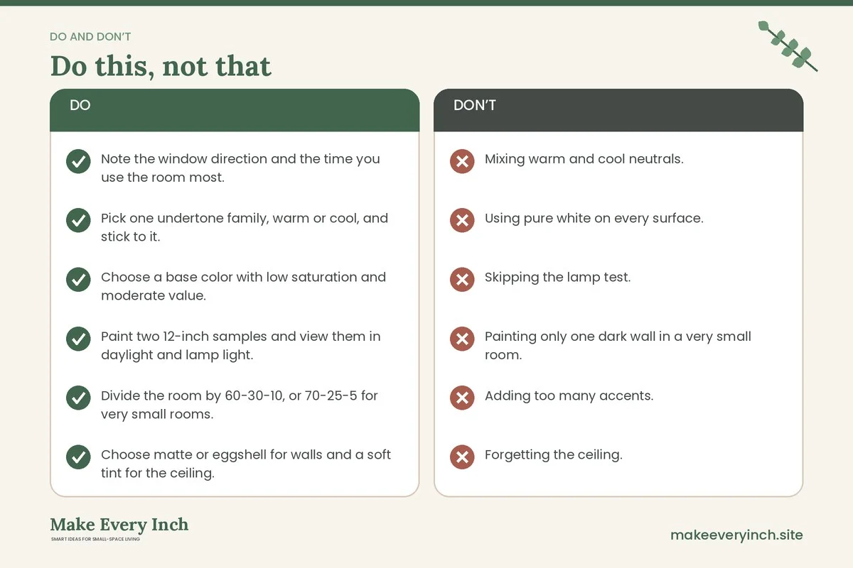
- Mixing warm and cool neutrals. A cool gray wall with a yellow-cream bedspread looks muddy. Match undertones.
- Using pure white on every surface. Stark white next to a warm tone looks cold and can glare. Choose a soft white.
- Skipping the lamp test. A color that looks calm at noon may turn too yellow or too dark under bedside bulbs.
- Painting only one dark wall in a very small room. An accent wall can chop the room into pieces. If you like depth, paint all four walls or choose a quiet accent in textiles instead.
- Adding too many accents. Three accent colors plus a pattern is already too much for 100 square feet. Pick one.
- Forgetting the ceiling. A bright white ceiling over soft walls pulls the eye upward and can make the room feel harsh. Use a tint of the wall color.
- Ignoring sleep light. Bright blue-white bulbs and screens near the bed work against any palette. Choose warm, dimmable light for evening.
Calm bedroom color checklist
- Note the window direction and the time you use the room most.
- Pick one undertone family, warm or cool, and stick to it.
- Choose a base color with low saturation and moderate value.
- Paint two 12-inch samples and view them in daylight and lamp light.
- Divide the room by 60-30-10, or 70-25-5 for very small rooms.
- Choose matte or eggshell for walls and a soft tint for the ceiling.
- Use low-VOC paint and open windows during and after painting.
- Turn off power before removing switch plates, and never paint outlets.
- Confirm lease rules, and ask in writing before painting.
- Keep patterns small and add texture instead of extra colors.
- Use warm, dimmable bedside light at around 2700 kelvin.
- Remove one accent if the room still feels busy.
FAQ
What is the most calming color for a small bedroom?
There is no single answer, though soft greens, muted blues, warm whites and gentle clay tones are common choices because they are low in saturation. The right one depends on your window direction and on the undertone of your bedding and wood tones.
Do dark colors make a small bedroom feel smaller?
Not necessarily. Dark colors can blur the edges of a room and make it feel cozy. The condition is that you keep contrast low, use the same tone on walls, ceiling and trim, and add enough lamp light so the room does not become gloomy.
Should the ceiling be white?
It does not have to be. A very pale tint of the wall color softens the room, while a plain white ceiling is the safest choice if you want to bounce as much light as possible.
How long should I wait before sleeping in a freshly painted room?
Ventilate for several days and let any smell clear before you sleep there. Follow the instructions on the can and use low-VOC paint to reduce the odor. If you notice headaches or irritation, keep the room aired and sleep elsewhere until it passes.
How can I get a calm palette in a rental?
Use bedding, curtains, a rug and lampshades to carry the palette, and warm the light with dimmable bulbs. Lean art on furniture instead of hanging it, and ask in writing before you change anything permanent.
Can I use more than one color on the walls?
You can, but keep the colors close in value and undertone. Two shades of the same green, or a warm white and a pale greige, give subtle depth without breaking the room into pieces.
Keep going: Keep going with our guides to small bedroom ideas that are cozy, small bedroom lighting ideas and small room color schemes that feel cohesive.
Save this guide for later
Pin the ideas you like to Pinterest so you can come back to them when you plan your space.