Small Room Color Schemes That Feel Cohesive: Five Palettes and a Rule
Quick answer: Small room color schemes cohesive enough to feel calm follow a simple split: about 60 percent a main neutral, about 30 percent a supporting tone and about 10 percent an accent, with each color repeated in at least two places. Choose one undertone family, add one texture per color, and keep it to three or four hues in a single room. Use low-VOC paint with good ventilation and get permission before painting a rental.
Small room color schemes cohesive from the first glance to the last corner share one trait: the eye can find the same few colors again and again. In a big house you can get away with a different mood in every corner, but in a small room there is no room to hide a stray color, so every shade you add either supports the others or fights them. This guide is about the second step after choosing your base shade. Our companion post on colors that make small rooms look bigger explains how light and contrast change perceived size. Here we focus on building a full, matching scheme: how to split color, how to choose a palette, how to repeat it, how to carry it across an open plan, and how to avoid the common slips. It covers the 60-30-10 split, a repeat rule, five ready palettes, material and texture, a comparison table, three example rooms, renter options, mistakes and a checklist. For the full overview, see our main guide to small room decor ideas.
What cohesive really means
A cohesive room is not a matching room. A set of identical furniture in a single color can feel flat and showroom-like. Cohesive means the parts clearly belong together. You can pin it down to three things.
- A shared undertone family. Most of your colors lean warm, or most lean cool. Mixing a warm cream with a cool gray in the same small space makes one of them look dirty.
- A short list. Three or four colors per room, not seven. Neutrals count, but they count lightly.
- Repetition. Every color shows up in at least two spots, ideally at different heights, so the eye travels around the room instead of stopping on a single object.
Hold those three ideas and you can build a scheme from almost any starting point, whether it is a rug you love, a bed frame you are keeping or a view out the window.
The 60-30-10 split, adjusted for small rooms
Designers often use a rough ratio to balance a scheme. It is a guideline, not a law, but it works because it gives the eye one dominant color, one supporting color and one small spark.
- About 60 percent: the main color. Usually walls, ceiling, large curtains and sometimes a big rug. It sets the mood. In a small room it is often a light or mid-tone neutral.
- About 30 percent: the secondary color. Large furniture, bedding, a second wall or a rug. It adds depth without competing.
- About 10 percent: the accent. Pillows, a throw, art, a lamp, a plant pot. It is where you can take a risk.
Small-room tweaks:
- Count what you see from the doorway, not what exists in the room. A hidden shelf of colorful books does not matter if the door faces a plain wall.
- Treat the floor as part of your 60 or 30, because it is a huge visual surface.
- Allow the accent to be two small hits of the same color rather than one large hit. Two small spots read as intentional, while one large spot reads as a statement that competes with the room.
The repeat rule: every color appears twice
The easiest way to make a small room look planned is to apply a simple rule: no color appears only once. If you bring in a rust-colored pillow, find a second rust thing, such as a small vase, a stripe in the rug or a book spine. If your accent is deep green, put a plant on one side of the room and a green throw on the other.
Why it works: a single-use color pulls attention to one spot and reads as a mistake. Repeated color creates a path. The eye hops between echoes, and that movement gives a small room a sense of rhythm and flow.
Practical ways to repeat:
- Echo a wall color in a frame mat or a vase.
- Echo a sofa tone in a throw on a chair across the room.
- Echo a metal finish, such as brass or black, in at least three small items, like a lamp base, a curtain rod and a picture frame.
- Echo a wood tone in a tray, a shelf and a frame so the wood feels deliberate.
Choose an anchor first
Rather than picking colors from scratch, start from an anchor you already have or one you will buy first. A good anchor is the biggest or hardest item to change.
1. A rug or a piece of art. Pull two or three colors from it and call them your scheme. This is the most forgiving route, because a good rug has already balanced its colors.
2. A sofa or a bed. If it is a neutral, the scheme is easy. If it is a strong color, let it be the 30 and keep the rest quiet.
3. A floor. In a rental the floor is fixed, so its undertone decides your warm or cool lean.
4. A view. A tree, brick wall or sky outside the window can tint the light and suggest colors that echo it.
Once the anchor is clear, find your base shade with the sampling steps in our post on colors that make small rooms look bigger, then build the rest around it.
Five palettes that tend to work in small rooms
These are recipes, not exact products. Adjust each to your light, check undertones against your floor and sample before buying.
1. Warm neutral base with a deep green accent
Walls in a soft warm white, a sofa or bed in oatmeal or sand, a wood floor or rug in mid-brown and accents in a deep, muted green. Repeat the green in a plant, a pillow and a framed print. It suits rooms with north light, because the warm base keeps the space from going cold. It works in living rooms and bedrooms.
2. Cool gray-blue with warm wood and white
Walls in a pale gray-blue, white trim, light wood furniture and linen curtains. Accents in sand or a muted rust. It suits sunny south-facing rooms and bedrooms where a calm mood matters. The wood keeps it from feeling icy.
3. Monochrome greige with black details
Several tints of the same greige across walls, sofa and rug, with thin black accents such as frames, lamp stems and curtain rods. The black creates crisp structure so the room does not look washed out. Keep the black to the 10 percent slot, and repeat it at least three times.
4. Soft blush, cream and brass
Pale blush on the walls or bedding, cream upholstery, and brass or warm gold metal accents. It suits bedrooms and small dressing areas. Keep the pink pale and slightly dusty so it reads as a neutral rather than a theme.
5. Deep and moody: navy or charcoal with warm lighting
For a room used mainly in the evening, a full-wrap dark wall, ceiling and trim, with mid-tone wood and warm, layered lamps. Add pale linen and one metallic accent. This works only if you commit to the full room and have good lamp light.
Material and texture: the hidden color
Two surfaces in the same color look different when their materials differ, and that difference adds interest without adding hues. In a restrained palette, texture does the work that extra colors would do in a busy room.
- Pair a matte wall with a slightly glossy lamp base.
- Pair a smooth sofa with a chunky knit throw.
- Pair a flat-woven rug with a nubby pillow.
- Pair a wood tray with a ceramic vase.
Aim for at least three textures per room: something soft, something hard and something with a visible grain. If your palette is pale, texture prevents the room from feeling blank. If it is dark, texture catches light and keeps surfaces from merging.
Carry a scheme across an open plan
In studios and open-plan homes the main trap is a living area, a sleeping nook and a dining spot each in a different palette. The result looks like three small rooms stuck together, and it makes the whole space look smaller.
Use these tactics:
- One base color for all walls. Keep it identical across zones unless there is a real wall to separate them.
- A shared accent that visits each zone. If your accent is rust, a pillow in the living area, a candle in the dining spot and a throw at the foot of the bed will thread the zones together.
- Zone with rugs, not paint. Different rugs, within the same palette, mark zones without breaking the continuity of the walls.
- Repeat metal and wood. If the dining chairs have black legs, repeat black in a frame near the bed.
Our posts on studio apartment color schemes and studio apartment layout ideas that create zones show how to apply this in a single room.
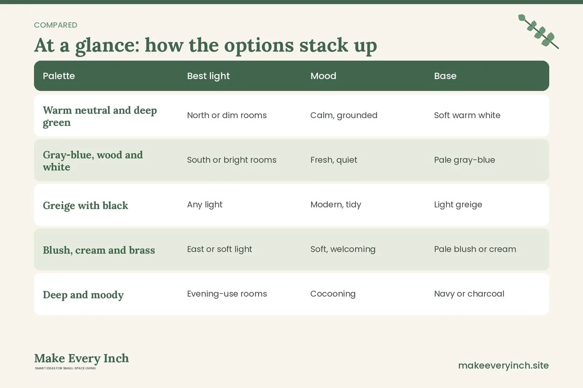
Comparison table: five palettes at a glance
| Palette | Best light | Mood | Base | Support | Accent | Watch out for |
|---|---|---|---|---|---|---|
| Warm neutral and deep green | North or dim rooms | Calm, grounded | Soft warm white | Oatmeal and mid wood | Muted deep green | Too much brown looks heavy |
| Gray-blue, wood and white | South or bright rooms | Fresh, quiet | Pale gray-blue | Light wood and white | Sand or soft rust | Cold feel with cool bulbs |
| Greige with black | Any light | Modern, tidy | Light greige | Mid greige | Thin black details | Flatness without texture |
| Blush, cream and brass | East or soft light | Soft, welcoming | Pale blush or cream | Cream upholstery | Warm brass | Too sweet if pink is saturated |
| Deep and moody | Evening-use rooms | Cocooning | Navy or charcoal | Mid wood and linen | One metallic | Dim daytime feel |
Three example rooms
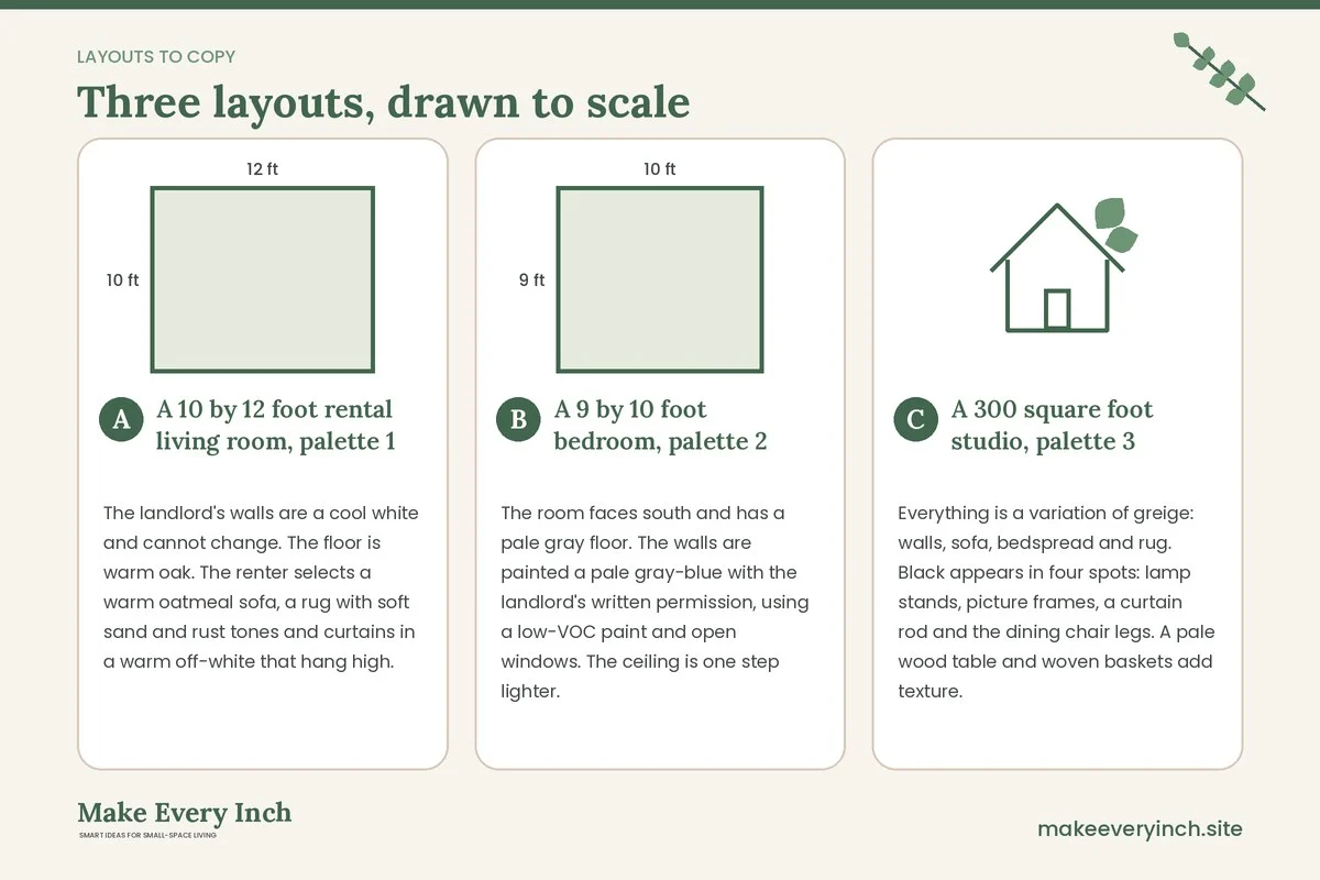
A 10 by 12 foot rental living room, palette 1
The landlord’s walls are a cool white and cannot change. The floor is warm oak. The renter selects a warm oatmeal sofa, a rug with soft sand and rust tones and curtains in a warm off-white that hang high. Deep green appears in a plant, a throw and a framed print on the opposite wall. Because the room has three main colors and the green repeats three times, it reads as planned. For more ideas, see our post on small apartment living room ideas.
A 9 by 10 foot bedroom, palette 2
The room faces south and has a pale gray floor. The walls are painted a pale gray-blue with the landlord’s written permission, using a low-VOC paint and open windows. The ceiling is one step lighter. A white bed frame, a light wood nightstand and linen bedding in a warm white keep the mood calm. A muted rust throw and a small rust vase add warmth. See our post on small bedroom ideas for the layout.
A 300 square foot studio, palette 3
Everything is a variation of greige: walls, sofa, bedspread and rug. Black appears in four spots: lamp stands, picture frames, a curtain rod and the dining chair legs. A pale wood table and woven baskets add texture. Because black is repeated and limited, the studio feels sharp but not stark. For more, see studio apartment decorating ideas.
Renter-friendly ways to build a scheme
If you cannot paint, build the scheme from items that move with you.
- Start with the rug. It is the biggest color change available to a renter.
- Use textiles. Curtains, bedding and throws carry the 30 and the 10.
- Keep the walls neutral. Work with the existing wall tone and match your undertone to it.
- Use lamps and bulbs. A warm bulb changes how the whole palette reads. See our post on renter friendly lighting ideas.
- Wall art without holes. Lean art on shelves or use adhesive hanging products within their weight limits. See renter friendly wall decor ideas.
- Temporary wallpaper only with permission. Check the lease and test a hidden patch first. See our post on removable wallpaper ideas.
Safety notes for color projects
- Paint: choose low-VOC paint when possible, keep the room ventilated during and after painting, and keep pets, children and anyone sensitive out until it has dried and aired. Follow the label.
- Older homes: if the building is old, do not sand or scrape paint before checking for lead. Follow local guidance.
- Lamps and bulbs: every lamp has a maximum wattage on its label. Do not exceed it, and do not use a bulb that is too hot for a fabric shade or an enclosed fixture. Do not cover a hot bulb with cloth. Keep shades clear of the bulb.
- Sockets and strips: do not plug too many items into one outlet or one power strip, and do not daisy-chain strips. If a plug feels warm, unplug it and ask an electrician.
- Cords: keep cords off walkways and away from heat and do not run them under rugs. Use cord clips that do not damage walls.
- Hanging art and mirrors: check the weight rating of every hook, strip or anchor, match it to the item with a margin and do not drill without permission. Do not hang heavy items over a bed or a sofa unless they are properly secured.
- Tall furniture: anchor bookcases and dressers to the wall where permitted, particularly with children or pets.
- Plants as accents: some common houseplants are toxic to cats, dogs and children. Check a trusted pet-safety list before bringing one home, and keep leaves out of reach where needed.
Common mistakes with small-room schemes
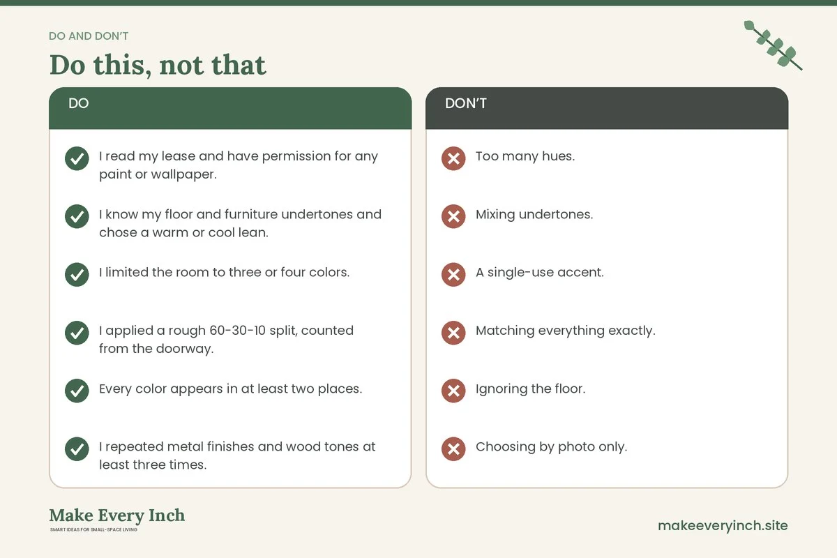
- Too many hues. More than four colors in a small room breaks it into pieces.
- Mixing undertones. A warm cream beside a cool gray can look muddy.
- A single-use accent. Color that appears once looks accidental.
- Matching everything exactly. A perfectly matched set looks flat. Vary tone and texture.
- Ignoring the floor. The floor is a major color surface and shapes the whole scheme.
- Choosing by photo only. Light changes color, so sample at home.
- Forgetting the bulb. A cool bulb can flatten a warm palette.
- A different palette in every zone. In open plans, the unbroken thread is what makes the home feel larger.
- Painting without permission. Always confirm what your lease allows.
A simple process, step by step
1. List the fixed items: floor, large furniture you are keeping and the view.
2. Identify their undertones and note whether they lean warm or cool.
3. Choose your 60: the base shade, sampled in two spots.
4. Choose your 30: a supporting tone for large furniture, bedding or a rug.
5. Choose your 10: one accent color, repeated at least twice.
6. Add a metal finish and a wood tone, and repeat each three times.
7. Add three textures.
8. Set your bulbs, then check the room in the evening.
9. Remove anything that does not fit. Subtraction often does more than addition.
Use our guides to budget small space ideas and apartment decorating styles to match the scheme to your budget and your style. Prices vary widely, so compare local options rather than relying on general numbers.
Your cohesive-scheme checklist
- I read my lease and have permission for any paint or wallpaper.
- I know my floor and furniture undertones and chose a warm or cool lean.
- I limited the room to three or four colors.
- I applied a rough 60-30-10 split, counted from the doorway.
- Every color appears in at least two places.
- I repeated metal finishes and wood tones at least three times.
- I included three textures: soft, hard and grainy.
- I carried the same base and accent across every zone in an open plan.
- I chose low-VOC paint and planned ventilation.
- I checked bulb wattage against each lamp label and avoided overloaded sockets.
- I checked weight ratings and anchoring for art, mirrors and tall furniture.
- I checked any plants for pet and child safety.
Frequently asked questions
How many colors should a small room have?
Three or four is a good limit, counting a main neutral, a supporting tone and one or two accents. Neutrals like white, wood and black count lightly, but they still need to be repeated deliberately.
What does 60-30-10 mean?
It is a rough guide for balance. About 60 percent of what you see is a main color, about 30 percent is a supporting color and about 10 percent is an accent. Adjust it to your room rather than measuring exactly.
Can I mix warm and cool colors?
Yes, if one dominates. Choose a warm or cool lean for the main surfaces and let the other appear in small amounts, such as a cool blue vase in a warm room. Avoid an even split.
How do I make a cohesive scheme in a studio?
Use one wall color throughout, thread a single accent through every zone and separate zones with rugs and furniture rather than paint. Repeat metals and woods in each area.
What if my landlord does not allow paint?
Build the scheme with a rug, curtains, bedding, lamps and art. Match the undertone of the existing walls and let textiles carry the 30 and the 10.
Is a monochrome room boring?
Not if you vary tone and texture. Several tints of the same color with different materials looks calm and layered, and a few dark details add structure.
How do I choose an accent color?
Pull it from an item you already love, such as a rug, a piece of art or a view. Choose a shade slightly muted so it does not dominate, and repeat it at least twice.
Keep going: Keep going with our small room decor ideas, colors that make small rooms look bigger and small dining room color schemes.
Save this guide for later
Pin the ideas you like to Pinterest so you can come back to them when you plan your space.