Small Home Office Color Schemes
Quick answer: The best small home office color schemes match the mood to the job. Soft blues and greens tend to support calm focus, warm yellows and corals can add energy, and layered neutrals keep a tiny room flexible. Pick one main wall color, two supporting tones and one accent, test samples in your real light, and choose low-VOC paint with good ventilation.
Small home office color schemes are different from living room palettes, because you spend long hours looking at one wall, one screen and one patch of light. A good scheme helps you concentrate, keeps the room from feeling cramped and gives you a pleasant background on video calls. This guide walks you through the psychology in plain terms, three palettes (focus, energy and calm), a table that compares them, how to build a backdrop for calls, how lighting changes color, how to choose and apply low-VOC paint safely, what to do in a rental, and three example rooms. It also includes a mistake list, a FAQ and a checklist. For the layout side, see our pillar guide on small home office ideas, and if you do not have a spare room at all, read the companion post on small home office ideas with no spare room.
How color affects a work space
Color does not control your mood, but it nudges it, and responses vary from person to person. Research and design folklore often link cool tones such as blue and green with calm and steadiness, warm tones such as yellow and orange with warmth and alertness, and deep dark shades with a cozy, enclosed feel. Treat these as tendencies, not guarantees. Your own reaction, your culture, your daylight and your job matter more than any chart.
In a small office, three practical effects matter most.
- Perceived size. Light, low-contrast colors bounce light and make walls recede, so a small room tends to feel larger. Dark colors can make walls feel closer, though they can also create a snug, focused cocoon when handled well.
- Eye comfort. A screen is a bright rectangle. A wall that is much brighter or much darker than the screen can tire your eyes. Medium-light, low-contrast surroundings are often more restful than stark white next to a glowing monitor.
- Mood over hours. A color that feels fresh for twenty minutes can feel loud after eight hours. Test your choice by living with a sample for a few days.
Start with the job, not the swatch
Ask what the room needs to do. A few examples:
- Deep focus work such as writing, coding or analysis: calm, steady and low in visual noise.
- Creative or social work such as design, brainstorming or calls: lively, with warmth.
- Mixed days with meetings and focus blocks: a calm base with swappable accents.
- Shared nook in a living area: a palette that matches the rest of the home, so the nook blends in.
Then list what you cannot change: floor color, large furniture, a window that faces north or south, a rental wall you cannot paint. Work with those fixed elements, because they will shape the room more than any new paint.
The 60-30-10 rule for a tiny office
A simple formula keeps a palette balanced. Use about 60 percent for the main color (walls and large surfaces), 30 percent for a secondary color (a desk, a curtain, a rug, a bookcase) and 10 percent for an accent (a lamp, a chair cushion, a print, a plant pot). In a small room, you can compress this: pick one wall color, one furniture tone and one accent. Keeping to three or four colors total makes a tiny room feel intentional rather than busy. Use texture, such as wood, linen or woven baskets, to add depth without adding more hues.
Palette 1: Focus
A focus palette keeps visual noise low and the mood steady.
- Main: soft blue-gray, sage green or a pale greige.
- Secondary: light natural wood, white oak tones or pale gray.
- Accent: a deeper navy, forest green or charcoal in small doses, plus a touch of warm brass or black for definition.
Why it works: cool, muted colors tend to read as calm, and a restrained palette gives the eye little to chase. Use matte or eggshell finishes to avoid glare on walls. Keep the desk surface plain, and let a plant or a framed print provide a single point of interest. If you spend long hours reading or writing, this scheme is a good default.
Try it when: you do detailed work, your room gets plenty of daylight, or you are easily distracted.
Palette 2: Energy
An energy palette adds warmth and brightness to wake up a sleepy room.
- Main: warm white, soft cream or a pale butter yellow.
- Secondary: light wood, tan or a gentle peach.
- Accent: coral, terracotta, mustard or a bright teal for contrast.
Why it works: warm tones are commonly associated with friendliness and alertness, and a small hit of a saturated accent can lift a neutral room. Limit the brightest color to a chair, a pinboard or a single wall behind the monitor, not the whole room. Too much saturated yellow or orange can feel intense over long hours, so soften with creamy whites and wood.
Try it when: your room faces north and feels cool, you do creative or social work, or your afternoons drag.
Palette 3: Calm
A calm palette is low in contrast and gentle on the senses, a good choice for stressful jobs.
- Main: warm off-white, light taupe or a pale clay.
- Secondary: linen, oatmeal and soft sand.
- Accent: muted green, dusty blue or a mid-tone terracotta.
Why it works: warm neutrals feel soft, and tone-on-tone layers give a sense of order without strain. This scheme is flexible, so you can swap a pillow or a print with the seasons. Add natural textures like cotton, wool, rattan and wood to keep it from feeling flat.
Try it when: your job involves long calls or intense decisions, you share the room with a bedroom or living space, or you like a spa-like atmosphere.
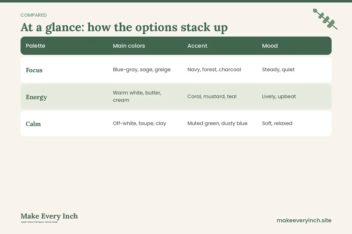
Comparison table: three palettes at a glance
| Palette | Main colors | Accent | Mood | Best finish | Best for | |
|---|---|---|---|---|---|---|
| Focus | Blue-gray, sage, greige | Navy, forest, charcoal | Steady, quiet | Matte or eggshell | Deep work, reading | |
| Energy | Warm white, butter, cream | Coral, mustard, teal | Lively, upbeat | Eggshell | Creative work, cool rooms | |
| Calm | Off-white, taupe, clay | Muted green, dusty blue | Soft, relaxed | Matte | Stressful days, shared spaces |
Remember that undertones matter. A gray can lean blue, green or purple, and a white can lean yellow or pink. Always compare against your floor and your furniture.
What about dark colors?
Deep navy, charcoal, forest green and dark plum are popular in small offices. They can make walls fade into the shadows and give a cozy, focused feel, particularly in rooms with limited daylight where a light color would look gray anyway. The trade-off is that dark rooms need more lamp light, and a dark wall behind a bright screen increases contrast. If you try a dark color, paint a single wall or use it on built-ins, add warm lamps at different heights and keep a lighter ceiling. Test samples first, since dark paints can look very different at night.
Lighting changes everything
A paint chip is not a paint color until you see it in your own light. Three factors change how a color reads.
Daylight direction
North-facing rooms get cooler, bluer light, which can make grays look cold and whites look dull, so warm undertones help. South-facing rooms get warm, strong light, which can make colors look brighter and warmer, so cooler tones can balance. East rooms are bright and warm in the morning and cooler later, while west rooms warm up in the afternoon. Look at your samples at several times of day.
Bulb color temperature
Bulbs are labeled in kelvin. Around 2700 kelvin is a warm, yellowish glow, while 3000 to 3500 is a soft neutral, and 4000 to 5000 is a cooler, whiter light often chosen for task work. Cool bulbs can turn a warm cream wall gray, and warm bulbs can turn a blue-gray wall greenish. Keep bulbs in one room at a similar temperature so your wall color looks consistent. A common choice for offices is a neutral white of about 3000 to 4000 kelvin, adjusting to taste.
Brightness and glare
Light bounces off walls, so a glossy finish can create glare on the screen. Use matte or eggshell paint, and position the desk so windows are at your side. A task lamp on the non-writing side reduces shadows on paper. For plug-in lighting that suits rentals, read our guide to renter-friendly lighting ideas, and for smaller zones see studio apartment lighting ideas.
Build a video call backdrop
For many people, the wall behind the desk is also a set. A good backdrop looks tidy and warm, and does not distract. Keep these tips in mind.
- Choose a mid-tone wall. Very bright white can blow out on camera, and very dark walls can swallow your shoulders. A mid-light blue-gray, sage or warm greige usually frames a face well.
- Avoid busy patterns. Stripes and small prints can shimmer on video. A plain wall with one or two objects looks cleaner.
- Add depth with layers. A plant, a shelf with three or four items, or a framed print creates a sense of space. Keep items off the center line so they do not appear to grow from your head.
- Mind the distance. If you can sit a few feet away from the wall, the background looks softer and more professional.
- Light your face first. Put a soft light in front of you, such as a lamp aimed at a wall or a window beside the screen. Avoid sitting with a bright window directly behind you, because the camera will turn you into a silhouette.
- Check the camera view. Open your camera app and look at the frame, including cords, laundry and clutter that might creep in.
- Hide what you can. A curtain, a screen or a bookcase can mask a bed or a door behind you.
If your nook is in a hallway or a corner, a portable backdrop such as a fabric panel or a folding screen creates a clean wall for calls. See diy room divider ideas for studio apartments for ideas.
Choose and apply low-VOC paint safely
Paint is a significant source of indoor fumes, and a small office is a small volume of air. Volatile organic compounds, or VOCs, are chemicals that evaporate from paint and some finishes. Low-VOC and zero-VOC products exist, and many people prefer them for a room where they will spend most of the day. Labels and standards vary by region, so read the product information, and note that even low-VOC paints give off some smell.
Practical safety steps:
- Get permission first. If you rent, check your lease and get written approval before painting, and ask about color restrictions or repaint-at-move-out requirements.
- Ventilate. Open windows and run a fan to move air out, not just around. Keep ventilation going during painting and for the time the product label recommends afterward.
- Keep sensitive people and pets out. Children, pregnant people, those with asthma or sensitivities, and pets may be affected by fumes. Ask a health professional if you have concerns.
- Follow the label. Read the instructions for drying time, recoat time and recommended protective gear.
- Use drop cloths and tape. Protect the floor and the trim, and keep paint away from outlets. Turn off power at the breaker before removing outlet covers, or leave covers on and tape them over.
- Do not paint over mold or damp. Fix the source of moisture first.
- Dispose of leftovers properly. Check local rules for paint disposal, and never pour it down a drain.
- Older homes. Homes built before the late 1970s in some regions may contain lead-based paint. Do not sand or scrape old paint without testing and following official guidance.
- Wait before moving back. Let the room air out before setting up your desk and electronics. Keep papers and devices away from wet paint.
When in doubt, hire a qualified painter or ask the paint supplier for advice.
If you cannot paint
Many renters cannot change wall color. You can still shift the mood of a small office.
- Fabric: a large piece of fabric on a tension rod or hung from adhesive hooks adds color. Test adhesive hooks in a hidden spot first, and respect the weight limits.
- Peel-and-stick panels: small panels behind the desk can create a feature wall, subject to your lease and a patch test.
- Furniture and rugs: a colorful rug or a bold chair can carry a palette.
- Lighting: colored shades and warm bulbs change the feel of the room.
- Art and plants: a few large pieces in your accent color can tie the room together.
- Folding screens: a screen behind the desk offers a ready-made backdrop that moves with you.
For more no-damage ideas, see our guides to renter-friendly lighting ideas and renter-friendly ways to hide cords, since messy cords undo even the best palette.
Three example rooms
Example 1: A north-facing bedroom corner
Elena works from a desk in the corner of a north-facing bedroom. The light is cool and often gray, and the room feels sleepy by mid-afternoon. She picks an energy-leaning palette: a warm white wall, a light oak desk, a mustard cushion on the chair and a terracotta pot with a plant. She swaps her bulb for a neutral white of around 3500 kelvin and positions the desk so that the window is on her left. If you also sleep in your work room, our guide to small bedroom ideas with a desk and small bedroom desk ideas can help.
Example 2: A hallway nook with a camera
Sam takes video calls from a hallway nook. The wall behind the desk is plain white and looks flat on camera. He picks a focus palette: a sage green fabric panel hung with removable hooks, a dark wood shelf with three items and a plug-in wall light for a soft glow. He places a lamp in front of the desk to light his face. He keeps the hallway clear of obstruction and notes that painting is not allowed. For layout help, read narrow hallway ideas.
Example 3: A studio living area
Noor works in a studio and needs the office to disappear after hours. She chooses a calm palette that matches the main room: warm off-white walls, a linen curtain, a light desk and a muted green accent. A folding screen hides the desk at night, and warm lamps change the mood. See studio apartment color schemes for a wider look at tying a whole studio together, and studio apartment ideas for working from home for layout ideas.
Desk, shelf and accessory colors
Do not forget the surfaces closest to your hands and eyes.
- Desk surface: a light matte surface reduces reflections and feels open. A dark desk looks refined but shows dust and crumbs.
- Mouse pad or desk mat: a mat in your accent color is a small way to add personality.
- Shelves: keep shelves mostly one color family, such as white boxes and natural baskets, so the wall stays calm.
- Storage boxes: matching containers hide clutter and keep the palette tidy. For ideas, read small space organization ideas.
- Chair: a neutral chair blends in, while a colored one becomes the accent.
- Cords and devices: white or black cords disappear against matching baseboards or walls. Bundle and cover cables. Check the load on your power strip and avoid daisy-chaining.
Safety notes for a small office
- Anchor tall furniture. Bookcases and cabinets can tip. Follow the manufacturer’s instructions for anchoring, and ask permission before drilling in a rental.
- Mind the electrical load. Do not plug heaters, kettles or other high-draw appliances into the same strip as your office gear. Use strips with built-in protection and check their rating.
- Keep cords out of walkways. Use covers or route them along walls.
- Keep vents and radiators clear. Do not paint over vent covers or block airflow with furniture.
- Lighting and glare. Avoid bright bare bulbs in your line of sight, and use shades or diffusers.
- Ergonomics. Screen height, seat height and breaks matter for comfort. This guide offers general information, not medical advice. Speak to a professional if you have pain or health concerns.
Mistakes to avoid
- Picking from a tiny chip under store lights. Test a large sample in your own room.
- Ignoring undertones. A gray that looks neutral in the store can look blue or purple at home.
- Using high-gloss paint. It reflects the screen and the window.
- Too many accent colors. Three or four colors are enough for a tiny room.
- Forgetting the ceiling. A white or slightly lighter ceiling bounces light and keeps the room open.
- Painting without ventilation. Fumes linger in a small space, so air the room well.
- Skipping the camera test. Check your background before an important call.
- Ignoring the rest of the home. If the nook is in an open space, make sure it fits the adjacent palette.

How to test a palette in a week
1. Pick two or three candidate colors and buy sample pots or large peel-and-stick samples, where permitted.
2. Apply or tape each sample on a big sheet of card, about 2 feet square, and move them around the room.
3. Look at them in the morning, midday and evening, and under your lamp.
4. Hold your accent items, such as a cushion or a mug, against each one.
5. Open your camera and check how each sample looks behind you.
6. Live with the samples for a few days, and choose the one you still like at the end of a long workday.
Frequently asked questions
What is the best color for focus in a small office?
There is no single answer, but soft blues, blue-grays and sages are common choices because they feel calm and steady. Choose a mid-tone, low-contrast shade and test it in your light.
Is white a good choice for a tiny office?
White can reflect light and feel clean, but it can look stark next to a bright screen and may feel cold in a north-facing room. A warm white or a pale greige often feels softer.
Will a dark color make my office feel smaller?
Dark colors can make walls feel nearer, but they can also create a cozy, focused mood. If you want to try one, use it on a single wall or on built-ins, and add lamps.
What color is best behind me on video calls?
A mid-tone, plain wall in blue-gray, sage or warm greige tends to look flattering. Avoid busy patterns and very bright white, and light your face from the front.
Is low-VOC paint odor-free?
Not always. It usually has fewer emissions, but many still have some smell. Ventilate the room, follow the label and give the room time to air out.
Can I use these ideas in a rental?
Yes, with fabric, screens, rugs, lighting and art. Check your lease before painting or applying anything to the walls, and ask permission in writing.
How many colors should I use?
Three or four is a good limit in a small room: a main color, a secondary color, an accent and a neutral. Texture can add richness without more hues.
Do I need special bulbs?
Not special, but consistent. Choose bulbs of the same color temperature in the room, around 3000 to 4000 kelvin for a neutral office feel, and adjust to your preference.
Color scheme checklist
- Decide whether the room needs focus, energy or calm.
- Check the direction of your daylight and the floor and furniture undertones.
- Choose a main color, a secondary color and an accent, and keep to three or four hues.
- Test large samples at different times of day and on camera.
- Pick matte or eggshell finishes to limit glare.
- Choose a low-VOC paint, get permission if you rent, and ventilate.
- Light your face for calls and place windows to the side.
- Add texture through wood, linen and plants.
- Tidy cords and anchor tall furniture.
- Review after two weeks and adjust the accents.
Keep going: Keep going with the pillar guide on small home office ideas, find a spot with small home office ideas with no spare room, and plan the setup with our DIY desk ideas for small spaces.
Save this guide for later
Pin the ideas you like to Pinterest so you can come back to them when you plan your space.