Small Kitchen Color Ideas That Feel Bright
Quick answer: The small kitchen color ideas that feel bright share three traits: a high light reflectance value (roughly 70 to 85 for walls and ceiling), an undertone that suits your window direction, and a finish with a little sheen on cabinets and trim. Pick one pale base for walls and cabinets, add one mid-tone and one dark accent, and always judge samples at morning, noon and evening under your real bulbs.
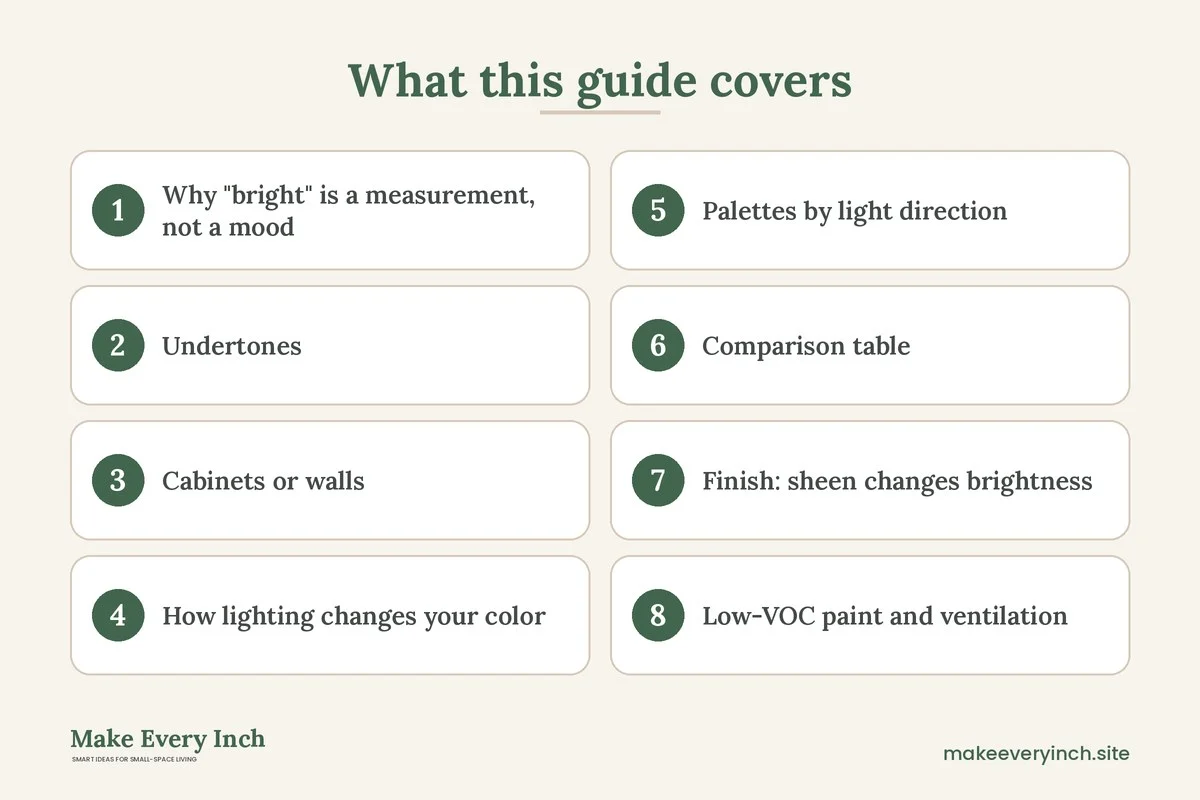
Small kitchen color ideas that feel bright are less about picking a trendy shade and more about managing light. A small kitchen usually has one window at best, a lot of vertical surfaces and several hard, reflective materials packed into a few square feet. The color on those surfaces decides whether the room bounces light around or swallows it. This guide explains the numbers behind a bright palette (light reflectance value), how undertones change from one window to another, whether to color the cabinets or the walls first, how artificial light interacts with paint, how to choose low-VOC paint and how to keep the room ventilated while you work. It ends with palettes organized by light direction, three example kitchens, a comparison table, a checklist and an FAQ. For the full overview, start with our pillar guide to small kitchen ideas, and pair this post with the companion guides on small kitchen lighting ideas and small kitchen makeover ideas.
Why “bright” is a measurement, not a mood
People describe a bright kitchen as white, cheerful or airy, but what they are really noticing is how much light the surfaces send back into the room. Paint companies publish this as the light reflectance value, usually shortened to LRV. It is a scale from 0 (absorbs all light, like a perfect black) to 100 (reflects all light, like a perfect mirror). Real paints sit somewhere in between.
As a rough guide, which varies by manufacturer and by the sample you are holding:
- LRV 80 to 90: very light whites and pale creams. These bounce the most light and are the standard choice for ceilings and for small kitchens with little daylight.
- LRV 60 to 79: soft colors such as pale sage, pale blue-gray, light greige and buttery yellow. These still feel light, and they hold color better than a stark white.
- LRV 40 to 59: true mid-tones such as medium sage, dusty blue and warm clay. Good for a single feature, such as a lower cabinet run, not for every surface in a tiny room.
- LRV below 40: deep greens, navy, charcoal and black. These absorb light and add depth, but a small room can handle only a limited amount.
The practical rule is simple. If a kitchen gets little natural light, keep most large surfaces (walls, ceiling and upper cabinets) at LRV 70 or above, and use anything darker as an accent. The LRV is usually printed on the back of the paint chip or on the manufacturer’s website. If you cannot find it, hold the chip next to a white sheet of paper in daylight and ask yourself whether it looks closer to the paper or to a gray card.
One caution. LRV is measured under controlled conditions, so a real wall with shadows, a cabinet overhang or a hanging pot rack will look darker than the number suggests. Treat the figure as a ranking tool, not a promise.
Undertones: the reason a “white” can look yellow, pink or gray
Every neutral has an undertone, a hint of another hue that shows up next to other colors and under different light. In a small kitchen, where a white cabinet sits a few inches from a white wall and a white tile, a clash of undertones is obvious.
Warm undertones
Creams, ivory and soft yellows have red or yellow in them. They feel inviting and flatter wood and brass. Under warm bulbs they can look slightly yellow, and in a north-facing room they can look dull and muddy.
Cool undertones
Whites with a blue, green or gray note look crisp and clean. They suit modern kitchens and flatter stainless steel and chrome. In a room with little light they can feel icy or clinical, and they can show every grease mark.
Neutral or balanced undertones
Some off-whites sit in the middle. They are the safest choice if you are unsure, but even these shift as daylight changes during the day.
How to find an undertone
Compare your chosen sample to a pure white sheet of paper in daylight. If it looks yellowish or pinkish against the paper, it is warm. If it looks bluish, greenish or grayish, it is cool. A second trick is to look at the darkest shade on the same paint strip, since the undertone is the most obvious there.
Match undertones across surfaces. If the countertop is a cool gray stone, a creamy wall may fight it. If the floor is a warm wood, a cool blue-white cabinet can look sharp against it. Fixed elements such as flooring, countertops and tile are hard to change, so choose paint to suit them.
Cabinets or walls: which gets the color first?
In a small kitchen the cabinets are the largest visual mass, often 40 to 60 percent of the visible surface. Walls take whatever is left. That means the cabinet color sets the overall brightness more than the wall color does.
When to color the cabinets
Light cabinets are the most effective way to raise brightness, especially when the upper cabinets run to the ceiling. Painting uppers and walls the same pale color makes the boxes recede and the room feel taller. A slightly glossier finish on the cabinets helps them bounce light.
When to color the walls
If the cabinets are in good shape and you cannot or do not want to repaint them, walls are the easier and cheaper change. Choose a wall color within one or two shades of the cabinet color, so the cabinet does not look like an island of different white.
The two-tone approach
Many small kitchens work well with light uppers and a deeper lower run. The darker base grounds the room, and the light uppers keep the eye moving upward. Keep the contrast moderate: a pale warm white above and a mid-tone sage or soft blue below is easier to live with than white above and black below in a tight space.
What to do with the ceiling
Paint the ceiling a flat, bright white with an LRV of 85 or more, or the same as the walls at a lighter step. Ceilings reflect light down into the room, so a darker ceiling shrinks the space unless your kitchen has plenty of light.
Rentals and no-paint options
If you cannot repaint, look at what you can change. Removable adhesive panels and sticker tile can lighten a backsplash, and a lighter countertop cover can help. See our guides on temporary backsplash ideas, renter-friendly kitchen upgrades and removable wallpaper ideas. Always check your lease before painting or applying adhesives to a surface.
How lighting changes your color
Paint never has a fixed color. It is the light that arrives at the wall minus the light the paint absorbs. Two kitchens painted the same shade can look nothing alike.
Daylight direction
- North-facing light is cooler, steadier and weaker. Colors tend to look grayer and bluer.
- South-facing light is warm and strong for most of the day. Colors look brighter and more yellow.
- East-facing light is warm and golden in the morning, then cooler and flatter after noon.
- West-facing light is dim and neutral in the morning, then warm and orange in the afternoon and evening.
Artificial light
Bulbs are labelled by color temperature in kelvins (K). A lower number is warmer.
- 2700 K is warm and yellow. It flatters woods, warm whites and reds, and it softens cool paint.
- 3000 K is a gentle warm white and a good all-purpose choice for kitchens.
- 3500 to 4000 K is neutral to cool white. It shows cool colors accurately and suits task lighting.
- 5000 K and up is daylight white. It can feel harsh in a small room and can turn a warm cream stark.
Choose a bulb with a high color rendering index (CRI), often shown as 90 or above, so food and paint look true. Use the same temperature for every light in the kitchen, or the room will look patchy. For layering ideas, see small kitchen lighting ideas and our guide on renter-friendly lighting ideas.
Reflective materials
Glossy backsplash tile, polished metal and glass doors bounce light and carry the color of whatever is near them. A mirror-finish backsplash next to a saturated wall will tint the whole kitchen. Keep reflective surfaces neutral, and let the paint carry the color.
Palettes by light direction
These are starting points, not rules. Always test samples in your own room.
North-facing kitchen (cool, low light)
Aim for warmth and high LRV. Try a warm white or a pale buttery cream on the walls, light cabinets with a warm undertone and wood or brass accents. Avoid blue-grays and cool whites, which can turn dingy. A soft yellow or pale peach on one wall can mimic sunshine.
South-facing kitchen (warm, strong light)
You have the most flexibility. Cool whites, soft greens and pale blues stay fresh and keep the room from feeling too hot. A deeper sage or blue on lower cabinets can handle the bright light. Be careful with creamy yellows, which can look intense at midday.
East-facing kitchen (warm morning, cooler afternoon)
Choose neutral or slightly warm whites that look good in both lights, such as a soft greige or a pale oatmeal. A light green or a pale warm gray works well. Test samples at 8 a.m. and at 4 p.m.
West-facing kitchen (dim morning, hot evening)
Cool or neutral tones balance the orange evening light, so a soft gray-white or pale blue-green is a good fit. Avoid very warm creams if the room already glows orange at dinner time.
Windowless or borrowed-light kitchen
Rely on artificial light and keep the palette light and warm. Use a bright white ceiling, pale walls with an LRV of 75 or more, and a mirror or glossy tile to move light around. Use 3000 K bulbs with a high CRI in several places, not just one ceiling fixture.
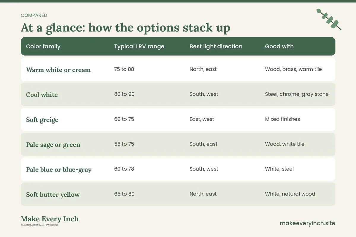
Comparison table: color families for small kitchens
| Color family | Typical LRV range | Best light direction | Good with | Watch out for |
|---|---|---|---|---|
| Warm white or cream | 75 to 88 | North, east | Wood, brass, warm tile | Can look yellow under warm bulbs |
| Cool white | 80 to 90 | South, west | Steel, chrome, gray stone | Can feel icy in dim rooms |
| Soft greige | 60 to 75 | East, west | Mixed finishes | Can look flat if the room is dark |
| Pale sage or green | 55 to 75 | South, east | Wood, white tile | Undertone may read gray at dusk |
| Pale blue or blue-gray | 60 to 78 | South, west | White, steel | Can chill a north room |
| Soft butter yellow | 65 to 80 | North, east | White, natural wood | Strong in full sun |
| Mid-tone sage or dusty blue | 35 to 55 | South, east | Light uppers, brass | Use on lowers or one wall only |
| Deep green or navy | 5 to 20 | South with bright bulbs | Pale walls, light floors | Absorbs light; keep to a small area |
Finish: sheen changes brightness
The same color looks different in matte, satin and gloss. Higher sheen reflects more light and wipes clean more easily, which matters in a kitchen. Too much gloss shows every brush mark and dent.
- Ceilings: flat or matte, which hides flaws and reduces glare.
- Walls: eggshell or satin. Satin is easier to clean around the stove and sink.
- Cabinets and trim: satin or semi-gloss, formulated for cabinets and hard-wearing surfaces.
- Backsplash paint areas: satin or semi-gloss in a washable formula, kept away from direct flame and high heat.
Prep matters as much as the can. Degrease the surfaces, sand lightly, prime when the label asks for it, and let each coat dry completely. Skipping the cleaning step is the most common reason kitchen paint peels.
Low-VOC paint and ventilation: a safety note
Paint releases volatile organic compounds (VOCs) as it dries. In a small, enclosed kitchen the fumes can linger, so ventilation is not optional.
- Choose low-VOC or zero-VOC paint where possible. Read the label and the safety data sheet. Low-VOC does not mean odor-free or risk-free, and tints can add VOCs.
- Ventilate during and after painting. Open windows, run an exhaust fan or set a fan to blow out of a window. Keep fresh air moving for as long as the label says.
- Keep pilot lights and flames in mind. Solvent-based products can be flammable. Read the warnings on the can, turn off ignition sources and keep the stove out of use while you paint if the label advises it.
- Protect vulnerable people. Keep children, pregnant people, pets and anyone with breathing problems out of the room until it is dry and aired, and follow the label.
- Wear a suitable mask when sanding, and use gloves and eye protection when you handle strippers or cleaners.
- Dispose of rags and leftover paint following your local rules, since oil-soaked rags can heat up and need safe handling.
- Ask first in a rental. Do not paint, drill or alter fixtures without written permission from the landlord.
Never sand old paint in an older home without checking whether it could contain lead. If your home was built before the late 1970s, follow local guidance on testing and safe removal before you disturb the surface.
Three example kitchens
Example 1: the dim north-facing galley
A narrow galley kitchen has one small north window and builder-grade cabinets. The goal is to feel sunnier. The plan is a warm white on walls and ceiling with an LRV of about 80, upper cabinets in the same warm white and lower cabinets in a soft greige at about LRV 65. Light wood shelving and brass hardware add warmth, and 3000 K bulbs with high CRI run under the upper cabinets. The result is a gentle glow rather than a cold shine. For layout help, see our guide to galley kitchen ideas.
Example 2: the south-facing apartment kitchen
A small apartment kitchen has a south window and white laminate counters. The plan is a pale sage on the walls at about LRV 70, white upper cabinets, a deeper sage on the base cabinets at about LRV 45 and a white tile backsplash. The strong light keeps the green fresh instead of heavy. This kind of plan suits the ideas in small apartment kitchen ideas.
Example 3: the windowless kitchen on a budget
A closet-style kitchen has no window. The plan is a bright white ceiling, walls in a very pale warm gray at about LRV 78, glossy white cabinets, a mirror panel on one side wall (if the lease allows it) and layered 3000 K lighting. A small bold accent comes from a colored runner and a few ceramic pieces on open shelves, not from the paint. See small kitchen ideas on a budget and budget small kitchen makeover for more low-cost ideas.
How to test samples properly
1. Buy sample pots, not tiny chips. Paint a sheet of white poster board or a large piece of primed board, not directly on the wall, so you can move it.
2. Make samples at least 12 by 12 inches and put them on at least two walls, one near the window and one far from it.
3. Watch at three times: morning, midday and evening, with the lights on and off.
4. Check next to fixed elements: the counter, the floor, the backsplash and any visible wood.
5. Live with it for a few days. First impressions change.
6. Narrow to two finalists, then paint a larger patch of each before you commit.
Accent ideas that add color without darkening the room
If you want personality without losing brightness, keep the big surfaces pale and add color in smaller moves.
- Painted interior of open shelves or a glass-front cabinet. A deep color inside a pale frame adds depth without shrinking the room.
- A colored door. The inside of a pantry door or a back door can carry a strong hue.
- Hardware. Warm brass, matte black or brushed metal can change the mood. Match metals across the room.
- Textiles. A runner, a dish towel set and a roller blind in a pattern are easy to swap. If you rent, see renter-friendly kitchen upgrades.
- Plants and herbs. A windowsill of green gives a natural, flexible accent.
- Open shelves styled in a limited palette. See small kitchen ideas with open shelving for display tips.
Common mistakes
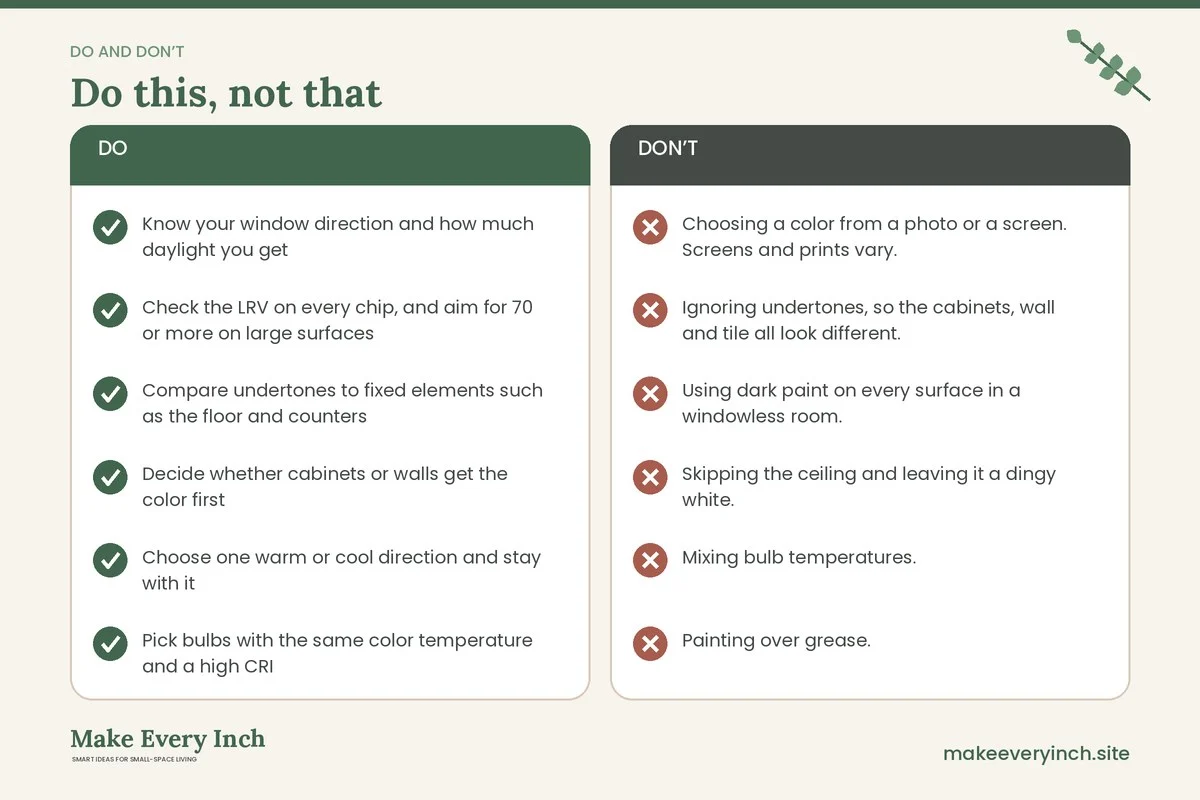
- Choosing a color from a photo or a screen. Screens and prints vary.
- Ignoring undertones, so the cabinets, wall and tile all look different.
- Using dark paint on every surface in a windowless room.
- Skipping the ceiling and leaving it a dingy white.
- Mixing bulb temperatures.
- Painting over grease.
- Not testing paint near the stove or the sink for washability.
- Painting without ventilation.
Bright kitchen color checklist
- Know your window direction and how much daylight you get
- Check the LRV on every chip, and aim for 70 or more on large surfaces
- Compare undertones to fixed elements such as the floor and counters
- Decide whether cabinets or walls get the color first
- Choose one warm or cool direction and stay with it
- Pick bulbs with the same color temperature and a high CRI
- Buy sample pots and paint large boards
- Test in morning, midday and evening light
- Choose low-VOC paint and plan ventilation
- Get written permission before painting a rental
- Degrease, sand and prime before painting
- Choose satin or semi-gloss for cabinets and trim
FAQ
What is the brightest color for a small kitchen?
A clean white or a very pale warm cream with a high light reflectance value reflects the most light. The best choice depends on your window direction and the undertone of your counters and floor.
Does white paint always make a small kitchen look bigger?
Usually it helps, but not always. A stark white in a dim north room can look gray. A white with a slightly warm undertone often looks brighter than a pure white in that situation.
Should I paint kitchen cabinets and walls the same color?
It is a good way to make a small kitchen feel calm and tall, since the cabinets blend into the walls. Many people choose the same color in different sheens, or a shade apart.
Can I use a dark color in a small kitchen?
Yes, in moderation. A deep color on lower cabinets or one wall can add depth, as long as the rest of the room stays light and the lighting is good.
What kitchen colors work with no natural light?
Pale warm tones with an LRV of 75 or higher, plus layered warm lighting. Avoid cool, gray tones that can turn dull under artificial light.
What is the safest paint for a kitchen?
Look for low-VOC paint that is labelled for kitchens or cabinets, follow the label for ventilation and cure time, and keep the room aired. Always read the safety data sheet.
Do I need primer?
Often yes, especially over glossy cabinets, stains or a big color change. Check the label of the paint you choose.
How long should I wait before using the kitchen after painting?
Follow the label, since drying and curing times vary. Paint can feel dry within hours but needs days or weeks to harden fully, so be gentle with scrubbing and avoid heavy wear at first.
How do I make a rental kitchen feel brighter without painting?
Use brighter bulbs with the right color temperature, add under-cabinet lighting, lighten the backsplash with removable tile and keep the counters clear. Read our small kitchen storage ideas to reduce clutter that darkens the room.
Keep going: Keep going with our small kitchen ideas pillar, the guide to small kitchen lighting ideas and the companion post on small kitchen appliances worth the space.
Save this guide for later
Pin the ideas you like to Pinterest so you can come back to them when you plan your space.