16 Small Home Decorating Ideas That Feel Cohesive in Every Room
Quick answer: Small home decorating cohesive ideas work by repeating a few choices from room to room instead of styling each room alone. Pick two or three anchor colors, one or two metals, one wood tone, one lighting temperature and one pattern family, then use them in every space you can see from a doorway. Vary the proportions, keep the sightlines calm, and let each room keep one personal surprise.
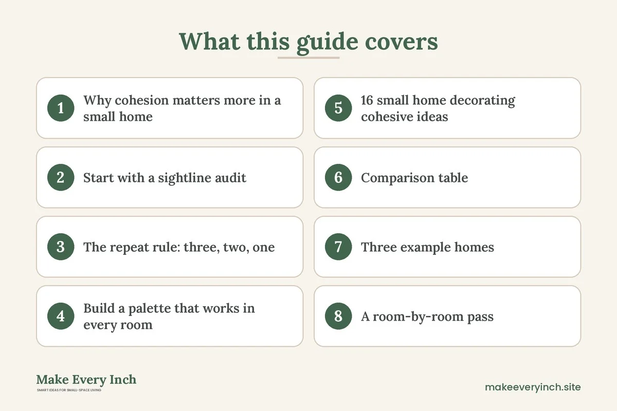
Small home decorating cohesive ideas start from a simple fact about compact homes: you can see most of them at once. In a large house, a bedroom can be pink and a kitchen can be navy because walls and hallways separate them. In a small home, a doorway often frames three rooms in a single glance, so every color, finish and shape is judged together. When the rooms disagree, the whole place feels busier and smaller than it is. When they agree, the home feels calm, deliberate and larger. This guide shows how to build that agreement without making every room identical. It covers the sightline audit, the repeat rule, a palette method, 16 ideas, a comparison table of linking tools, three example homes, a room-by-room pass, safety notes and a checklist. For the wider approach to compact homes, read our main guide on small home ideas, then see how the same thinking applies to a single space in small room color schemes that feel cohesive.
Why cohesion matters more in a small home
Cohesion does not mean matching. A matching home looks like a showroom, and it is tiring to live in. Cohesion means that the rooms share a few visible decisions, so the eye reads them as chapters of one story. In a small home this has three practical benefits.
First, it reduces visual noise. The eye has to process every contrasting color and pattern it can see. When several rooms share the same two or three colors, the brain groups them and the total feels quieter. Second, it makes transitions feel generous. A hallway that carries the same wall color or flooring as the living room reads as a continuation, not a separate small box. Third, it makes buying easier. If you know your palette and your finishes, you can decide on a lamp, a throw or a set of hooks in seconds, because you are choosing within a set, not from the whole world.
A cohesive home is also easier to keep tidy. Items that belong to the same family look intentional when they sit out, so you need fewer closed cabinets to hide them. That matters in a compact home, where hidden storage is always limited.
Start with a sightline audit
Before you buy a single can of paint, walk through the home and stand in each doorway. Note what you can see from that spot. Take a photo from each position, because photos flatten the view and reveal clashes you have stopped noticing. Most small homes have only five to eight key sightlines: the view from the entry, from the sofa, from the bed, from the kitchen counter, from the desk and from the bathroom door.
For each sightline, ask three questions. What is the first thing the eye lands on? Which colors and finishes appear in the same frame? Is there a spot where the view ends in clutter, a closed door, a blank wall or a pile of cords? The answers become your design brief. The first thing the eye lands on should be something you chose, such as a plant, a mirror or a piece of art. The colors in the frame should belong to the same family. The end of the view should be calm.
Mark each sightline on a rough floor plan and number the problem frames. Frames that show two rooms in one glance are the most important, so start there. A frame that shows a yellow kitchen wall beside a gray hallway and a green sofa is a good candidate for a color thread, which is the next step.
The repeat rule: three, two, one
One simple rule keeps a small home cohesive without becoming boring. Use three colors, two metals or hardware finishes, and one wood tone across the whole home. Add one pattern family, such as stripes, checks or organic shapes, and let it appear in different sizes.
- Three colors: one dominant light shade for walls, one mid-tone for textiles and large furniture, and one accent for small objects. The proportions are roughly 60, 30 and 10 percent, as a guide.
- Two metals: for example, one warm and one cool, or simply one. Repeat the same finish on hooks, lamp bases, cabinet pulls and picture frames.
- One wood tone: choose a light, medium or dark wood and keep new wooden pieces close to it. A few different woods are fine if they share an undertone, which means the same warm or cool cast.
- One pattern family: pick a single motif and repeat it at different scales, such as a small check on a cushion, a wider check on a throw and a larger check on a rug.
These numbers are a starting point, not a law. A bold home might use four colors, and a very quiet one might use two. The point is that the number is limited and you know what it is. When you stand in a shop holding something new, you can check it against your list in a few seconds.
Build a palette that works in every room
A palette for a whole home has to survive different light. A north-facing bedroom makes colors look cooler and grayer, while a south-facing kitchen makes them warmer. Test a color in the room where it will live, on at least two walls, and look at it in morning, midday and evening light before you commit.
Start from what you cannot change: flooring, countertops, tile, the color of built-in cabinets. These fixed elements set the undertone for the palette. If the floors are warm honey, choose colors with a warm undertone. If the bathroom tile is cool gray, pick shades that are happy next to it. Renters especially should treat fixed finishes as the starting point and let paint, textiles and accessories carry the rest.
Next, choose one color that appears in every space. This is your thread. It can be a soft off-white on all walls, a particular blue in cushions, art and a towel, or a muted green in plants, a lampshade and a vase. The thread does not need to be loud. It needs to show up in each room at least twice, so that the eye can connect the rooms. If you want to work with wall color itself, our guide on colors that make small rooms look bigger explains how light and mid-tone shades behave in compact spaces.
Finally, plan a different dominant color for each room only if you can see the rooms separately. If two rooms are visible together, they should share the dominant shade and differ only in the accent. A bedroom visible from the hallway can have deeper, moodier tones if the door usually stays closed, because the closed door acts as a boundary.
16 small home decorating cohesive ideas
Color and paint
1. One shared wall color for the shared spaces
Use the same light wall color in the entry, hallway, living area and kitchen where they connect. Private rooms can shift a shade. A single wall color across connected spaces removes the visual lines that make a home feel chopped into pieces. Choose low-VOC paint where you can, and open windows while it dries.
2. A color thread in every room
Pick one accent, such as a clay, a sage or a deep blue, and make sure it appears at least twice in each room. A cushion and a vase will do. This is the cheapest way to link rooms, and it works in a rental where you cannot paint.
3. Paint the trim and doors the same
Doors, frames and baseboards in one consistent shade create clean lines that read as a frame for every room. If you cannot paint them, keep the objects near them neutral so they do not fight the existing trim.
4. Let one room go darker, with a bridge
A darker bedroom or bathroom adds depth, as long as a bridge ties it back: a throw in the living room that matches the bedroom wall, or a towel that picks up the hallway tone. Without the bridge, the dark room looks like a different home.
Materials and finishes
5. Repeat one wood tone
Pick a wood tone and echo it in a shelf, a picture frame, a stool and a tray in different rooms. Small repeats are enough. Matching every piece exactly is not necessary and looks stiff.
6. Standardize hardware
Swap or choose lamp bases, hooks, curtain rods and pulls in one or two finishes. Hardware is small but it appears in every frame, so inconsistency is easy to notice. Renters can use removable hooks and keep original hardware stored for move-out.
7. Repeat a texture
Linen, boucle, woven rattan, ceramic or matte metal can be your texture family. Using the same texture in three rooms gives the home a tactile identity. A woven basket in the entry, a woven shade in the living area and a woven tray in the bedroom is enough.
8. Choose one flooring story
If the flooring changes from room to room, soften the join with rugs in the same palette, and keep thresholds clean. A runner in the hallway that shares a color with the living room rug carries the eye across the change.
Light, layout and sightlines
9. One lighting temperature
Pick bulbs of a similar warmth for all rooms you can see together. Mixing very warm and very cool bulbs in neighboring rooms makes walls look different colors in the evening. Our guide to layered lighting ideas for small apartments explains how to combine ambient, task and accent light.
10. A calm end to every sightline
Make sure each long view finishes on something intentional: a mirror, a plant, a piece of art or a lit lamp. Avoid ending a view on a laundry rack, a cable bundle or a stack of boxes. Our post on renter-friendly ways to hide cords helps with the last one.
11. Align heights across rooms
Hang art at a consistent center height, about 57 inches from the floor as a common guide, and keep curtain rods at a similar height throughout. Repeating a line, such as the top of the doors and the curtains, gives the home a quiet order.
12. Mirror placement that links rooms
A mirror opposite a window doubles light, and a mirror placed in a hallway can reflect the living room palette. Read our small room mirror placement ideas for positions that avoid glare. Anchor large mirrors properly, and never drill into a wall without permission.
Styling and details
13. One pattern family at different scales
Use a single pattern idea, like a check, a stripe or a leaf, at different sizes in different rooms. A large pattern on a rug and a small one on a cushion read as related, not repeated.
14. Repeat plants and greenery
One kind of plant, or plants in one kind of pot, in every room links the rooms in a natural way. Check that plants are safe for pets and children, because many common houseplants are toxic when chewed. See our ideas for small space plants and planters.
15. A consistent gallery logic
Use the same frame color or mat style in every room, while the content changes. A hallway full of family photos and a living room with prints look related if the frames match. Our hallway gallery wall ideas for small homes shows how to do this in a narrow space.
16. A personal surprise in each room
Cohesion fails when it becomes sterile. Let each room keep one thing that does not follow the rules, such as an inherited chair, a loud print or a collection. Because everything else is calm, the surprise looks like a feature.
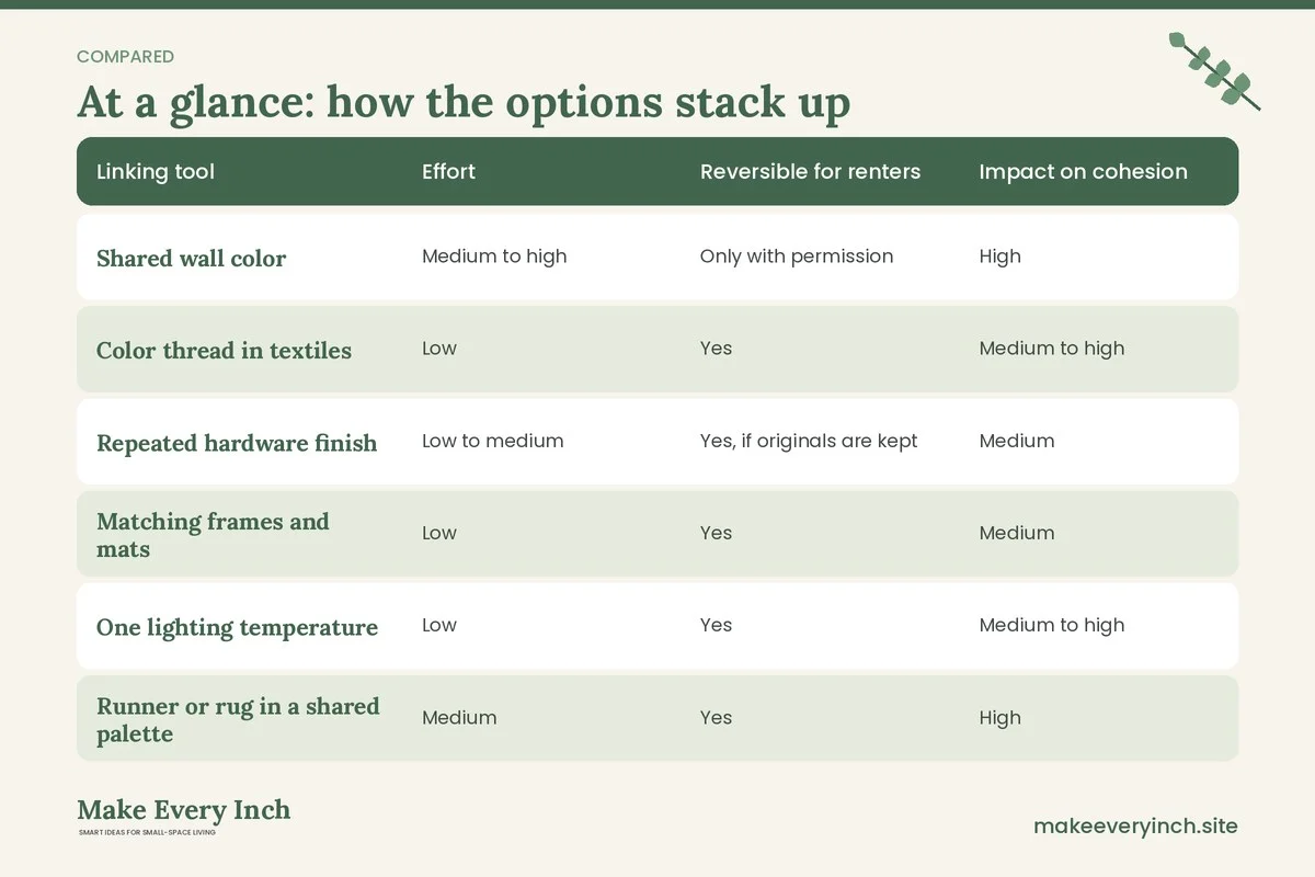
Comparison table: linking tools by effort and impact
| Linking tool | Effort | Reversible for renters | Impact on cohesion | Best used for |
|---|---|---|---|---|
| Shared wall color | Medium to high | Only with permission | High | Connected shared spaces |
| Color thread in textiles | Low | Yes | Medium to high | Any home, any lease |
| Repeated hardware finish | Low to medium | Yes, if originals are kept | Medium | Hooks, lamps, pulls |
| Matching frames and mats | Low | Yes | Medium | Hallways and living areas |
| One lighting temperature | Low | Yes | Medium to high | Rooms visible together |
| Runner or rug in a shared palette | Medium | Yes | High | Changing floor types |
| Repeated plant or pot style | Low | Yes | Low to medium | Softening hard lines |
| Consistent art height | Low | Yes | Medium | Long sightlines |
Start in the top half of the table if you want maximum impact for little effort. Rooms that sit together benefit most from a shared wall color, a shared light temperature and a rug in a shared palette. Renters can get most of the effect from the color thread, the lighting and the frames alone.
Three example homes
A 600 square foot one-bedroom
The entry opens straight into the living room, which opens into the kitchen. From the door, you can see the sofa, the dining nook and the kitchen counter in a single frame. The plan is a warm off-white on every wall in that frame, a sage accent used in a cushion, a plant pot and a kitchen towel, and brass-toned hardware in the lamps and the hooks. The bedroom, which is behind a door, goes a shade deeper in the same off-white family with a sage bedspread. Wood tone is a mid oak, repeated on a stool, a tray and a shelf. The result is that the main frame reads as one calm space, and the bedroom feels like its own cozy chapter.
A 450 square foot studio
A studio has no doors between zones, so cohesion is the only way to separate them without walls. The sleeping, living and eating areas share one wall color and one lighting temperature. Each zone gets its own accent from the same palette: a dusty blue by the bed, a terracotta by the sofa and a cream at the table. A rug under each zone keeps the boundaries clear, and all rugs share a pattern family. Furniture legs share a wood tone. Our guide to studio apartment layout ideas that create zones pairs well with this approach.
A two-bedroom rental with a long hallway
The hallway is the spine of the home, and it can either connect or divide. Here the plan is a runner in the palette colors, wall art in matching frames, a single warm light source and a mirror at the end that reflects the living room. Each bedroom door is the same color. The children’s room has bright accents, but the bedding shares one palette color with the hallway, so it feels connected. The hallway carries a plain, consistent look so the rooms can be as lively as they like. See narrow hallway ideas for more on this kind of space.
A room-by-room pass
After you set the rules, walk through each room and apply them in order.
- Entry: the entry sets the tone. Use the shared wall color, the hardware finish and the wood tone here, and keep the sightline into the home calm. See small entryway ideas.
- Living area: this is the main frame. Check the color thread, the lighting temperature and the rug palette. Our small living room ideas guide covers the furniture side.
- Kitchen: repeat the metal finish and the wood tone, and echo an accent in towels or a plant. Open shelving is visible from other rooms, so style it with the same palette. Our small kitchen ideas offer more.
- Bedroom: this room can be the most personal, as long as one palette color or texture links it back. See small bedroom ideas.
- Bathroom: it is often visible from the hallway. Use towels, a mat and a plant in the shared palette. See small bathroom ideas.
- Home office corner: if the desk is in the living area, choose storage and a lamp in the shared finish so it blends in. See small home office ideas.
Safety and practical notes
Decorating changes the home, so keep a few safety points in mind.
- Check your lease: ask for written permission before painting, hanging heavy items or changing fixed hardware. Never drill without permission.
- Anchor tall furniture: bookcases, tall shelves and large mirrors can tip, especially in homes with children or pets. Use the manufacturer’s anchoring method on a suitable wall, or choose low furniture instead.
- Keep exits clear: a decorating plan must never block a door, a window that serves as an exit or the path to the entrance. Leave the way out of every room clear, and keep the route to smoke alarms and exits free.
- Mind electrical load: when you add lamps and string lights, avoid overloading a single outlet or daisy-chaining power strips. Follow the rating on cords and strips. Do not run cords under rugs.
- Ventilate when painting: choose low-VOC paint, open windows, and let rooms air out before sleeping in them. Keep children and pets away from wet paint.
- Respect walls and structure: do not remove or alter walls to improve flow without a qualified professional and the required permits. Some walls are load-bearing.
- Heat and light: do not place mirrors where they focus sunlight onto fabric or furniture, and keep fabric away from bulbs and heaters.
Mistakes that break cohesion
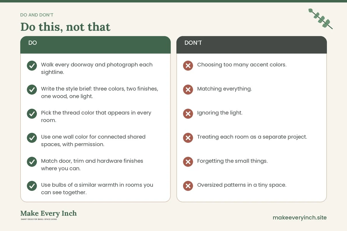
- Choosing too many accent colors. More than three or four colors across the visible rooms creates noise. Edit down.
- Matching everything. A home where every piece is the same color and finish feels flat. Use variation in texture and scale.
- Ignoring the light. A color that looks calm in a shop can look green or gray in your north-facing room. Test it first.
- Treating each room as a separate project. Plan the frame, not the room. Walk the sightlines before you buy.
- Forgetting the small things. Cords, mismatched hangers, a bright dish rack or a random trash bin often break an otherwise calm frame.
- Oversized patterns in a tiny space. Large, high-contrast patterns shrink a small room. Use them in one place only.
- Skipping the edit. Cohesion needs space. Remove or store anything that does not belong to the palette, even if it is nice.
A simple style brief you can write in ten minutes
Cohesion is easier when you write it down. Take a sheet of paper and fill in these lines.
- Mood in three words: for example, calm, warm and light.
- Three colors: wall, mid-tone and accent, with a name or a swatch for each.
- Two finishes: the hardware metals you will repeat.
- One wood tone: light, medium or dark, and warm or cool.
- One light temperature: warm, neutral or cool for the visible rooms.
- One texture family: linen, wool, woven or matte ceramic.
- One pattern: a motif you will repeat at different scales.
- One surprise per room: the personal item that gets to break the rules.
Keep the page in your phone or on the fridge. When you buy something, check it against the brief. When a friend gives you a gift that does not fit, thank them, enjoy it for a while, and decide kindly whether it earns a place.
Budget and shopping approach
A cohesive home is often cheaper than a mismatched one, because you stop buying one-off pieces that do not fit. Shop your own home first: move cushions, lamps and frames between rooms, and see which ones already belong to the palette. Next, fill gaps with secondhand finds, and repaint or re-cover items to match the brief. Our guides on thrifted apartment decor ideas and budget small space ideas explain how to do this without overspending. Buy in order of impact: lighting temperature and a shared wall color first, textiles and rugs next, then art and small objects. Do not buy a full set at once. Live with the first changes for a week, and adjust.
Maintenance: keeping the look cohesive over time
Cohesion fades when new things come in. Set a gentle rule: one in, one out, and every new item must fit the brief. Review the home once a season. Walk the sightlines, take new photos and look for drift. If a color has crept in, either make it the new accent or retire it. Seasonal changes, such as a throw or a wreath, can follow the thread color, so the seasons change the surface but not the structure. Refresh plants and flowers in the same vases, so the look stays familiar.
When your life changes, such as a new baby, a roommate or a work-from-home schedule, update the brief before you update the furniture. A new baby needs soft edges and wipeable surfaces, and a home office needs good light and cable control. If you change the brief first, the new pieces will join the story and not fight it.
Cohesion checklist
- Walk every doorway and photograph each sightline.
- Write the style brief: three colors, two finishes, one wood, one light.
- Pick the thread color that appears in every room.
- Use one wall color for connected shared spaces, with permission.
- Match door, trim and hardware finishes where you can.
- Use bulbs of a similar warmth in rooms you can see together.
- Add a rug or runner in the shared palette where floors change.
- Hang art at a consistent center height.
- Repeat one plant or pot style, and check pet safety.
- Use matching frames in hallways and living areas.
- Anchor tall furniture and large mirrors, and keep exits clear.
- Let each room keep one personal surprise.
FAQ
How do I make a small home feel cohesive without painting?
Use a color thread in textiles, art and objects, repeat one hardware finish, match your lamp bulbs and add rugs in a shared palette. These changes are all reversible and they work in a rental.
Do all the rooms need the same color?
No. Rooms you can see together should share a dominant color, and rooms behind a closed door can differ. Link them with a thread color or a repeated material so the move between them feels natural.
How many colors should a small home use?
Three is a good starting point, in roughly 60, 30 and 10 percent proportions. Fewer colors give a calmer home, and more work if the shades are close in tone or undertone.
Can I mix wood tones and metals?
Yes, within limits. Keep to one main wood tone and one or two metals, and mix others in small amounts. Matching the undertone, warm or cool, matters more than matching the exact shade.
How do I decorate a home with very different furniture?
Unify with color and texture. Throws, cushions, a shared rug palette and matching frames pull different pieces together. You can also repaint or re-cover a few key items to sit closer to the palette.
Is it better to use light or dark colors in a small home?
Light colors reflect light and keep sightlines open, which suits the shared spaces. Dark colors can look rich in a private room, especially when it has good lighting and a bridge to the rest of the home.
How do I keep a cohesive home when I live with other people?
Agree on a short brief: the colors, the finishes and the light temperature for shared rooms. Let each person decorate their own room more freely, and keep one repeating element, such as frames or plants, that connects them.
Keep going: Keep planning with our small home ideas guide, small room decor ideas and best furniture for small apartments.
Save this guide for later
Pin the ideas you like to Pinterest so you can come back to them when you plan your space.